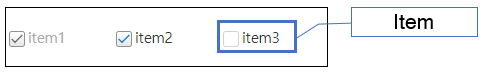
Check box group
Control that allows multiple selections among various options.
There is a characteristic where multiple checkboxes form a group and are used together. Both single selection and multiple selection are possible among multiple checkboxes. If a checkbox is already checked and clicked again, it will be unchecked.
The items displayed in the checkbox group can be composed of two types.
1. Preceding data : Configure the fixed item.
2. Binding : Bind with the dataset.
| Boundary | Key | Action |
|---|---|---|
| Item | Shift upwards | |
| Item | Shift downwards | |
| Item | Shift left | |
| Item | Shift right | |
| Item | Uncheck the checkbox if the checkbox has already been checked. Check the checkbox if the checkbox has not been checked. |
Control component
Description on the checkbox group screen composition
| Flow layout format design(colCount=-1) | Vertical design (colCount=1) | Multi-column design (colCount=3) |
|---|---|---|
 |
 |
 |
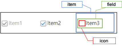
Component
| Component | Type | Description |
|---|---|---|
| Item | cpr.controls.Item | Item of the checkbox group. |
Example: Using the component
var checkBoxGroup_1 = new cpr.controls.CheckBoxGroup("cbg1");
var item = checkBoxGroup_1.getItem(1);
item.label = "test2";
item.value = "test2";

checkBoxGroup_1.value = "test2";
Style component
Theme file: checkbox.part.less

Component
| Component | Description |
|---|---|
| cl-checkboxgroup | Style of the checkbox group. |
| cl-checkbox | Checkbox style of the checkbox group. |
| cl-checkbox-field |
The style of the combined area of the checkbox icon and text within a checkbox group. When you click on the corresponding area, the selection state of the icon will be changed. |
| cl-icon-wrapper | The style of the area that wraps the icon of the checkbox within the checkbox group. |
| cl-checkbox-icon | Checkbox icon style of the checkbox group. |
| cl-text | Internal text style of the checkbox group. |
Status element
| Component | Status element | Description |
|---|---|---|
| cl-checkbox | cl-checked | Style when the checkbox is checked. |
| cl-disabled | Style when the checkbox is disabled. | |
| cl-hover | Style the checkbox is hovered. |
Changing the style property by using the CSS file
@CHARSET "UTF-8";

/* Checkbox group style */
.cl-checkboxgroup {
	color: #333;
}

/* Style when the checkbox group is in enabled status */
.cl-checkboxgroup:not(.cl-disabled) {
	cursor: pointer;
}

/* Icon style when the checkbox is checked(Checkbox group's item share the checkbox style) */
.cl-checkbox.cl-checked .cl-checkbox-icon {
	background-image: url(icons/checkbox-selected.png);
}
Component
| Component | Description |
|---|---|
| item | Styler of the checkbox group item(checkbox). |
| icon | Icon styler of the checkbox group item(checkbox). |
| field | Styler of the area that combines the icon and text of an item (checkbox) within the checkbox group. |
Changing the style property by using the styler
var checkBoxGroup_1 = app.lookup("cbg1");
/* Default style of the checkbox group (Multiple settings can be configured using JSON data.) */
checkBoxGroup_1.style.css({
	"border": "2px solid red",
	"background-color": "yellow"
});

/* Default style of the checkbox group (When setting a single style, you can use the following format.) */
checkBoxGroup_1.style.css("border", "2px solid blue");

/* Checkbox group item(Checkbox) style */
checkBoxGroup_1.style.item.css({
	"border": "2px solid red"
});

/* Icon style of the checkbox group item */
checkBoxGroup_1.style.icon.css({
	"border": "2px solid red"
});

/* Style of the area that combines icon and text of the checkbox group item(check box) */
checkBoxGroup_1.style.field.css({
	"background-color": "pink"
});
Example
Creating the checkbox group
Example of creating the checkbox group with preceding data and binding.
var checkBoxGroup_1 = new cpr.controls.CheckBoxGroup("cbg1");
/* Creating with the preceding data */
checkBoxGroup_1.addItem(new cpr.controls.Item("item1", "value1"));
checkBoxGroup_1.addItem(new cpr.controls.Item("item2", "value2"));
checkBoxGroup_1.addItem(new cpr.controls.Item("item3", "value3"));

checkBoxGroup_1.value = "value3";

/* Select items with the index '0', '2' */
checkBoxGroup_1.selectItems([0,2]);

/* Select items with the value 'value1', 'value2' */
var item1 = checkBoxGroup_1.getItemByValue("value1");
var item2 = checkBoxGroup_1.getItemByValue("value2");

checkBoxGroup_1.selectItems([item1,item2]);

/* Creating the dataset through binding */
/* Creating dataset */
var dataSet_1 = new cpr.data.DataSet("dataSet");
dataSet_1.parseData({
	"columns": [
		{"name": "label"},
		{"name": "value"}
	],
	"rows": [
		{"label": "item4", "value": "value4"},
		{"label": "item5", "value": "value5"},
		{"label": "item6", "value": "value6"}
	]
});

/* Checkbox group binding */
checkBoxGroup_1.setItemSet(dataSet_1, {label: "label", value: "value"});
Related API: value , cpr.controls.Item , addItem , parseData , setItemSet , selectItems , CheckBoxGroup API overview
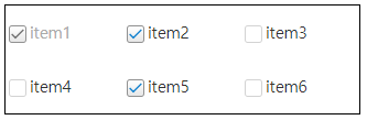
Configuring the checkbox group layout
The checkbox group's layout is in table format. You can configure the desirable horizontal size(column count).
var checkBoxGroup_1 = new cpr.controls.CheckBoxGroup("cbg1");
checkBoxGroup_1.addItem(new cpr.controls.Item("item1", "value1"));
checkBoxGroup_1.addItem(new cpr.controls.Item("item2", "value2"));
checkBoxGroup_1.addItem(new cpr.controls.Item("item3", "value3"));

/* "columnCount" of the checkbox group has been set to 3. */
checkBoxGroup_1.colCount = 3;
Related API: cpr.controls.Item , addItem , colCount , CheckBoxGroup API overview
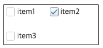
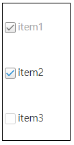
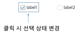
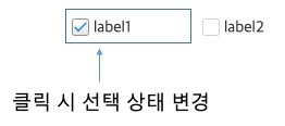
Checkbox group item icon selection area
The default behavior is that the selection state changes when you click on the "cl-checkbox-field" area.
If there is whitespace between the icon and the text area, applying the following CSS will allow the checkbox state to change even when clicking on the whitespace.
checkbox.part.less@CHARSET "UTF-8";
/* Check and uncheck the item when clicking on the whitespace */
.cl-checkboxgroup .cl-checkbox .cl-checkbox-field {
width: 100%;
}Comparing before and after applying CSS
-
Before applying CSS
-
After applying CSS
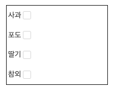
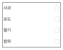
Right-aligned checkbox icon position
When the iconAlign property value is set to "right", you can align the checkbox icon to the right of the item label.
var checkBoxGroup_1 = new cpr.controls.CheckBoxGroup("cbg1");
checkBoxGroup_1.addItem(new cpr.controls.Item("Apple", "value1"));
checkBoxGroup_1.addItem(new cpr.controls.Item("Grape", "value2"));
checkBoxGroup_1.addItem(new cpr.controls.Item("Strawberry", "value3"));
checkBoxGroup_1.addItem(new cpr.controls.Item("Korean melon", "value4"));

/* Configure the column count of the checkbox group as 1. */
checkBoxGroup_1.colCount = 1;

/* Align checkbox icon on the right side */
checkBoxGroup_1.iconAlign = "right";
If you want to align the checkbox icon to the right end of the item, you need the following CSS settings.
checkbox.part.less@CHARSET "UTF-8";
.cl-checkboxgroup .cl-checkbox .cl-checkbox-field {
width: 100%;
}
.cl-checkboxgroup .cl-checkbox .cl-checkbox-field .cl-text{
width: 100%;
}
-
Before applying CSS
-
After applying CSS
Related API: cpr.controls.Item , iconAlign , colCount , CheckBoxGroup API overview