File input
A control that allows the user to select a file.
Use accept property to define the file format that can be selected by the control.
Web accessibility
Have to provide a label.
-
Configure the fieldLabel property and provide label to the file input.
Example
var fileInput = app.lookup("fi");

fileInput.bind("fieldLabel").toExpression("value? 'Select an image, '+value+' An image file has been selected.' : 'Select an image, Either click or drag the image file.'");
Control components
Description on the file input screen composition
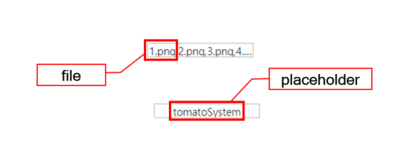
Component
| Component | Type | Description |
|---|---|---|
| file | File | File to be uploaded. |
| placeholder | String | Text that is shown before selecting a file. |
Example: using the component
var file = app.lookup("file1");

/* Text shown before selecting a file */
file.placeholder = "Double click or Drag & Drop";

/* Open file chooser dialog */
file.openFileChooser();

/* Uploaded file */
console.log(file.files);
Style component
Theme file: file-input.part.less

Component
| Component | Description |
|---|---|
| cl-fileinput | File input style. |
| cl-text | Text style of the file input. |
| cl-fileinput-clear | Clear button style of the file input. |
Changing the style property by using the CSS file
@CHARSET "UTF-8";

/* File input style */
.cl-fileinput {
  	border: 1px solid green;
  	background-color: black;
}

/* Style of a file that has been hovered after getting dragged */
.cl-fileinput-draghover {
  border-color: red;
}
Changing the style property by using the styler
// UI Configuration
var fileInput_1 = new cpr.controls.FileInput("fileinput1");

/* Default style of the file input */
/* You can use json data for multiple selection. */
fileInput_1.style.css({
	"border": "2px solid green",
	"color": "red"
});

/* Default style of the file input (For single style selection)*/
fileInput_1.style.css("border": "2px solid green");

/* Clear button style of the file input */
fileInput_1.style.clear.css("backgruond-color", "red");
Example
Creating a file input
Description of the example of creating a file input.
var fileInput_1 = new cpr.controls.FileInput("fileinput1");
fileInput_1.placeholder = "Double click or Drag & Drop";

/* Multiple file selection enabled for file input */
fileInput_1.multiple = true;

/* File selection possible through file input drop event */
fileInput_1.droppableFile = true;
Related API: placeholder , multiple , droppableFile , FileInput API overview
Configuring file selection
Description for the example on file expander/size setting.
var fileInput_1 = new cpr.controls.FileInput("fileinput1");

/* Configure the file expander that will be shown in the file chooser */
/* File expander: .gif, .jpg, .png */
fileInput_1.acceptFile = ".png";

/* Configure the selectable maximum data size of the file*/
fileInput_1.limitFileSize = "10kb";
Related API: acceptFile , limitFileSize , FileInput API overview
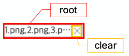
Display setting for the clear button
You can display the clear button based on the value of the showClearButton property of the file input. The default value is false. You can use the clearButtonImage property to set an image for the clear button. The clear button will only be displayed when the file input has a value.
var fileInput_1 = new cpr.controls.FileInput("fileinput1");
//Setting an image for the clear button
fileInput_1.clearButtonImage = "../tomato.png";

//Display a clear button
fileInput_1.showClearButton = true;
Related API: clearButtonImage , showClearButton , FileInput API overview