Grid Examples
Create grid
This is an example of creating a grid.
var grid_1 = new cpr.controls.Grid("grd1");
grid_1.init({
dataSet: app.lookup("ds1"),
// hScroll: "auto", // set horizontal scroll style= "auto" or "scroll" or "hidden"
// vScroll: "auto", // Sets vertical scroll style= "auto" or "scroll" or "hidden"
// wheelRowCount: 5, // Number of rows scrolled at one time with the wheel
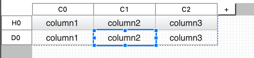
columns: [ // Width value for each column.
{ width: "30px" }, { width: "30px" }, { width: "30px" }
],
header: { // Header area configuration information.
rows:
[{height:"30px"},{height:"20px"}], // Height of each header row. Multiple lines are indicated using commas (,). [Unit: px]
cells: [ // Cell configuration information inside the header area.
// rowIndex: Row index where the cell is located. (0 base)
// colIndex: Column index where the corresponding cell is located. (0 base)
// rowSpan: The number of rows that the cell will merge vertically. (default : 1)
// colSpan: The number of columns that the corresponding cell will merge horizontally. (default: 1)
// text: (Optional) Text to be displayed in the corresponding header cell.
// sortcolumnName: (Optional) Name of the dataset column to be sorted when the corresponding header cell is clicked.
// visible: (Optional) Sets the visibility of the entire column where the corresponding header cell is located. (default: true)
{
constraint : { rowIndex: 0, colIndex: 0, rowSpan: 2, colSpan: 1 },
configurator : function(cell){
cell.text = "A";
cell.sortColumnName = "a";
cell.visible = false;
}
},{
constraint : { rowIndex: 0, colIndex: 1, rowSpan: 1, colSpan: 2 },
configurator : function(cell){
cell.text = "B + C";
cell.visible = true;
}
},{
constraint : { rowIndex: 1, colIndex: 1, rowSpan: 1, colSpan: 1 },
configurator : function(cell){
cell.text = "B";
cell.sortColumnName = "b";
cell.visible = true;
}
},{
constraint : { rowIndex: 1, colIndex: 2, rowSpan: 1, colSpan: 1 },
configurator : function(cell){
cell.text = "C";
cell.sortColumnName = "c";
cell.visible = true;
}
}
]
},
detail: { // detail area configuration information.
rows: [{height:"20px"}], // Height of each detail row. Multiple lines are indicated using commas (,). [Unit: px]
cells: [ // Cell configuration information inside the detail area.
// columnName: (Optional) Name of the dataset column to be connected to the corresponding detail cell.
// suppressible: (Optional) Hides text in cells that match the value of the immediately preceding row. (provides cell merging effect) (default: false)
// suppressref: (Optional) Set other columns to affect the suppressible (cell text hiding) effect.
// control: (Optional) UIControl to be placed in the corresponding detail cell.
{
constraint : { rowIndex: 0, colIndex: 0, rowSpan: 1, colSpan: 1 },
configurator : function(cell){
cell.columnName = "a";
cell.suppressible = "true";
}
},{
constraint : { rowIndex: 0, colIndex: 1, rowSpan: 1, colSpan: 1 },
configurator : function(cell){
cell.columnName = "b";
cell.suppressible = "true";
}
},{
constraint : { rowIndex: 0, colIndex: 2, rowSpan: 1, colSpan: 1 },
configurator : function(cell){
cell.columnName = "c";
cell.control = new cpr.controls.InputBox();
}
}
]
},
footer: { // (Optional) Footer area configuration information.
rows: [{height:"20px"}], // Height of each footer row. Multiple lines are indicated using commas (,). [Unit: px]
cells: [ // Cell configuration information inside the footer area.
// expr: (Optional) Text or expression to be displayed in the corresponding footer cell.
{
constraint : { rowIndex: 0, colIndex: 0, rowSpan: 1, colSpan: 1 },
configurator : function(cell){
cell.expr = "footer_a";
}
},{
constraint : { rowIndex: 0, colIndex: 1, rowSpan: 1, colSpan: 1 },
configurator : function(cell){
cell.expr = "footer_b";
}
},{
constraint : { rowIndex: 0, colIndex: 2, rowSpan: 1, colSpan: 1 },
configurator : function(cell){
cell.expr = "getSum('c')";
}
}
]
}
});Relevant APIs: init , Grid API 전체보기
Create a row group
You can group columns by criteria within the grid.
component
| components | Description | Related API |
|---|---|---|
| group | You can add a group of grids. Multiple groups can be created by adding groups with higher or lower DEPTH within the group. The higher the group is placed on the grid editor, the higher the group. You can. | collapsible |
| header | The area consisting of column headings. | header |
| footer | This is the area shown at the bottom of the grid. You can summarize the data in the grid through exprssion. | footer |
Property
| Property name | Description |
|---|---|
| activate | Indicates whether the group is active. It can be changed with Grid.setActivateRowGroup. |
| groupCondition | Indicates the condition of a group. |
| startCollapse | If the grid control property collapsible=true, whether to initially collapse the group. |
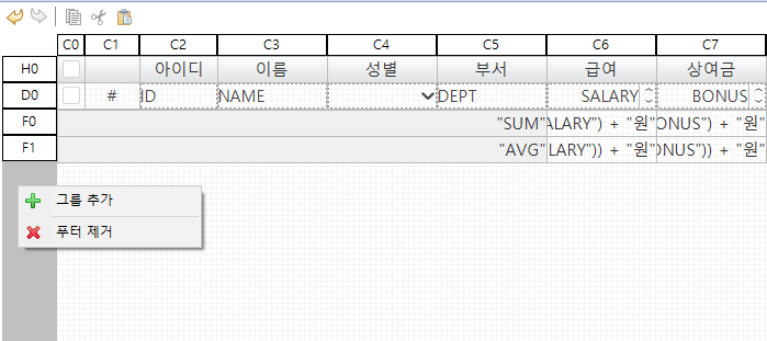
This is an example of creating a group in a grid.
var grid_1 = new cpr.controls.Grid("grd1");
grid_1.init({
dataSet: app.lookup("ds1"),
columns: [
{ width: "30px" }, { width: "30px" }, { width: "30px" }
],
header: {
rows:
[{height:"30px"},{height:"20px"}],
cells: [
{
constraint : { rowIndex: 0, colIndex: 0, rowSpan: 2, colSpan: 1 },
configurator : function(cell){
cell.text = "A";
cell.sortColumnName = "a";
cell.visible = false;
}
},{
constraint : { rowIndex: 0, colIndex: 1, rowSpan: 1, colSpan: 2 },
configurator : function(cell){
cell.text = "B + C";
cell.visible = true;
}
},{
constraint : { rowIndex: 1, colIndex: 1, rowSpan: 1, colSpan: 1 },
configurator : function(cell){
cell.text = "B";
cell.sortColumnName = "b";
cell.visible = true;
}
},{
constraint : { rowIndex: 1, colIndex: 2, rowSpan: 1, colSpan: 1 },
configurator : function(cell){
cell.text = "C";
cell.sortColumnName = "c";
cell.visible = true;
}
}
]
},
detail: {
rows: [{height:"20px"}],
cells: [
{
constraint : { rowIndex: 0, colIndex: 0, rowSpan: 1, colSpan: 1 },
configurator : function(cell){
cell.columnName = "a";
cell.suppressible = "true";
}
},{
constraint : { rowIndex: 0, colIndex: 1, rowSpan: 1, colSpan: 1 },
configurator : function(cell){
cell.columnName = "b";
cell.suppressible = "true";
}
},{
constraint : { rowIndex: 0, colIndex: 2, rowSpan: 1, colSpan: 1 },
configurator : function(cell){
cell.columnName = "c";
cell.control = new cpr.controls.InputBox();
}
}
]
},
footer: {
rows: [{height:"20px"}],
cells: [
{
constraint : { rowIndex: 0, colIndex: 0, rowSpan: 1, colSpan: 1 },
configurator : function(cell){
cell.expr = "footer_a";
}
},{
constraint : { rowIndex: 0, colIndex: 1, rowSpan: 1, colSpan: 1 },
configurator : function(cell){
cell.expr = "footer_b";
}
},{
constraint : { rowIndex: 0, colIndex: 2, rowSpan: 1, colSpan: 1 },
configurator : function(cell){
cell.expr = "getSum('c')";
}
}
]
},
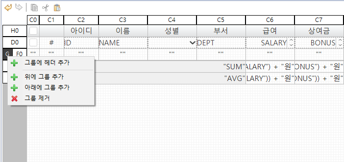
rowGroup: [{
groupCondition: "group1",
gheader: {
rows: [
{height: "30px"}
],
cells: [
{
constraint: { rowIndex: 0, colIndex: 0, rowSpan: 0, colSpan: 0},
configurator: function(cell){
cell.tooltip = "gHeader";
}
}
]
},
gfooter: {
rows: [
{height: "20px"}
],
cells: [
{
constraint: { rowIndex: 0, colIndex: 0, rowSpan: 0, colSpan: 0},
configurator: function(cell){
cell.tooltip = "gFooter";
}
}
]
}
}]
});Relevant APIs: init , Grid API 전체보기
Add/Edit/Delete row
Grids and datasets are connected, so you can add, edit, or delete rows through the grid.
var grid = app. lookup("grd1");

// Add a new row to the third row of the grid.
var insertRow = grid. insertRow(1, true);

// You can use updateRow to update the data of the new row at once.
grid.updateRow(insertRow.getIndex(), {"A": "newA", "B": "newB", "C": "newC", "D": "newD"});
// Alternatively, you can use setValue to modify the data directly on the new row.
insertRow.setValue("A", "modifyA");

// Delete the first row of the grid.
grid.deleteRow(0);

// Get the value of column C in the first row of the grid.
alert(grid.getCellValue(0, "C"));
Relevant APIs: insertRow , updateRow , deleteRow , getCellValue , GridRow.setValue , GridRow API 전체보기 , Grid API 전체보기
Sort
The grid can be sorted using the column names of the dataset connected to the grid.
Write as below. In case of ascending order, "asc" can be omitted.
ascending order: [column name] (asc)
descending order: [column name] desc
var grid = app. lookup("grd1");

/* Sort */
// Sort grid C column in descending order.
grid.sort("C desc");
// Check the registered sorting information.
alert(grid. getSort());
// Remove the registered sort.
grid. clearSort();
// Check if it was removed normally.
alert(grid. getSort());

/* Multi-sort */
// Sort grid column C in descending order and column A in ascending order.
grid.sort("C desc, A");
// Check the registered sorting information.
alert(grid.getSort());
Relevant APIs: sort , getSort , clearSort , Grid API 전체보기
Filter
The grid can be filtered using the column information of the dataset connected to the grid.
var grid = app. lookup("grd1");
/* filter */
// Filter the rows where the value of column D of the grid is greater than 30.
grid.filter("D >= 30");
// Check the registered filtering information.
alert(grid. getFilter());
// Remove registered filtering.
grid. clearFilter();
// Filter rows ending in 'A' for values in column A of the grid.
grid.filter("A $= 'A'");
alert(grid. getFilter());
grid. clearFilter();
/* Multiple filters */
// Filters rows whose value in column A of the grid ends in 'A' and whose value in column D is greater than 30.
grid.filter("A $= 'A' && D >= 30");
alert(grid.getFilter());
Relevant APIs: filter , getFilter , clearFilter , Grid API 전체보기
Find rows matching the criteria
The grid can find rows that match the criteria.
var grid = app. lookup("grd1");

// Find only one row where the value of column D of the grid is greater than 30.
var findRow = grid.findFirstRow("D >= 30");
// Check the index of the search result row.
alert(findRow.getIndex());

// Find all rows where the value of column D of the grid is greater than 30.
var findRows = grid. findAllRow("D >= 30");
// Check the size of the row array, which is the search result.
alert(findRows.length);
Relevant APIs: findFirstRow , GridRow.getIndex , findAllRow , GridRow API 전체보기 , Grid API 전체보기
Select row
You can change the selection unit of the grid, get the currently selected row or change the selected row.
var grid = app. lookup("grd1");

/* If the properties related to the selection are changed as shown below, the current selection is initialized. */
// Change the grid selection unit to row.
grid.selectionUnit = "row";
// Change to grid multiple selection mode.
grid.selectionMulti = "multi";

// Get the currently selected row index array.
var rowIndices = grid. getSelectedRowIndices();
alert(rowIndices. length);

// Get the currently selected row.
var selectedRow = grid. getSelectedRow();
// Get the value of column 'A' of the selected row.
alert(selectedRow. getValue("A"));

// Select the second row of the grid.
grid. selectRows([1]);
// Or select the second row of the grid as shown below.
grid.select([{"rowIndex": 2}]);

// Remove all selections.
grid.clearSelection();
Relevant APIs: selectionUnit , selectionMulti , getSelectedRowIndices , getSelectedRow , selectRows , select , clearSelection , GridRow.getValue , GridRow API 전체보기 , Grid API 전체보기
Switch to edit mode
Grid rows have view mode and edit mode, and the mode can be changed through API.
var grid = app. lookup("grd1");

// Set the second row of the grid to edit mode.
grid.setEditRowIndex(1);
// Move the focus to the third cell in the second row of the grid.
grid. focusCell(1, 2);
// Get the index of the row in edit mode in the current grid.
alert(grid. getEditRowIndex());

// Cancel the edit mode of the grid.
// When edit mode is cancelled, if there is a row currently in edit mode, the corresponding row is changed to selection mode.
grid. setEditRowIndex(-1);
// Check if the current grid is in editing state.
alert(grid.isEditing());
Relevant APIs: setEditRowIndex , focusCell , getEditRowIndex , isEditing , Grid API 전체보기
Use checkbox
Place an actual checkbox in the grid header, and use columnType='checkbox' in detail to select a row.
/* Header Makes all check boxes in the detail area select or deselect according to the check value of the check box. */

// Add value-change event to header checkbox.
function onCbx1ValueChange(/* cpr.events.CValueChangeEvent */ e){
	var cbx1 = e.control;
	var grid = app. lookup("grd1");
	if (cbx1.checked) { // checked
		grid.checkAllRow();
	} else { // uncheck
		grid.clearAllCheck();
	}
}

// ...

/* Set/get checkbox check in detail */

var grid = app. lookup("grd1");

// Check the check boxes in the 1st and 4th rows of the grid.
grid.setCheckRowIndex(0, true);
grid. setCheckRowIndex(3, true);

// Check if the 4th row is checked.
alert(grid. isCheckedRow(3));
// Get the currently checked row index array.
var checkRowIndices = grid.getCheckRowIndices();
alert(checkRowIndices.length);
Relevant APIs: checked , checkAllRow , clearAllCheck , setCheckRowIndex , isCheckedRow , getCheckRowIndices , Grid API 전체보기
Apply gridfixed
It is possible to fix header cells on the left and right sides of the grid. If the cell to be frozen is merged by colSpan, it is included and frozen.
It is possible to fix the top and bottom of the grid detail area by row. In the case of row fixation, only the height of the fixed region can be set initially, and the number of rows to be fixed can be set dynamically.
var grid = app. lookup("grd1");

// Set the horizontal size of the left frame lock to 100px and the number of fixed cells to 2.
grid. leftSplitWidth = 100;
grid. leftSplit = 2;

// Set the horizontal size of the right frame lock to 100px and the number of fixed cells to 1.
grid.rightSplitWidth = 100;
grid. rightSplit = 1;

// Fix the row at the top of the detail area.
// Set the fixed height to 50px and the number of fixed rows to 2.
// For topSplit, only dynamic settings are possible.
grid.topSplitHeight = 50;
grid. topSplit = 2;

// Fix the row at the bottom of the detail area.
// Set the fixed height to 50px and the number of fixed rows to 1.
// For bottomSplit, only dynamic settings are possible.
grid.bottomSplitHeight = 50;
grid.bottomSplit = 1;
Relevant APIs: leftSplitWidth , leftSplit , rightSplitWidth , rightSplit , topSplitHeight , topSplit , bottomSplitHeight , bottomSplit , Grid API 전체보기
Move column
You can move grid columns. When cells are merged by rowSpan and colSpan, they are moved to one column.
var grid = app. lookup("grd1");

// Set the grid header to be movable.
grid. columnMovable = true;

// Move the 4th column of the grid before the 2nd column.
grid. moveColumn(3, 1);
// Move the third column of the grid after the fourth column.
grid.moveColumn(2, 4, false);
Relevant APIs: columnMovable , moveColumn , Grid API 전체보기
Change column size
You can change the grid column size.
var grid = app. lookup("grd1");

// Set the size of all headers in the grid to be adjustable.
grid.resizableColumns = "all";

// Set the width of the second column of the grid to 200px.
grid.resizeColumn(1, "200px");
// Set the width of the third column of the grid to 150px.
grid.resizeColumn(2, "150px");
Relevant APIs: resizableColumns , resizeColumn , Grid API 전체보기
Add/remove dynamic column
You can dynamically add or delete columns to the grid.
var grid = app. lookup("grd1");

// Add a regular column with no controls placed on the grid.
grid. addColumn({
	columnLayout: [{
		width: "100px"
	}],
	header: [{
		constraint: {
			rowIndex: 0,
			colIndex : 5
		},
		configurator: function(cell){
			cell.text = "E";
		}
	}],
	detail: [{
		constraint: {
			rowIndex: 0,
			colIndex : 5
		},
		configurator: function(cell){
			cell.columnName = "E";
		}
	}]
});

// Add the inputbox column to the grid.
grid. addColumn({
	columnLayout: [{
		width: "100px"
	}],
	header : [{
		constraint: {
			rowIndex: 0,
			colIndex : 6
		},
		configurator: function(cell){
			cell.text = "F";
		}
	}],
	// Creates a column in which the inputBox is placed in detail.
	detail: [{
		constraint: {
			rowIndex: 0,
			colIndex : 6
		},
		configurator: function(cell){
			cell.columnName = "F";
			cell.control = (function(){
				var inputBox_1 = new cpr.controls.InputBox("ipb1");
				if(inputBox_1.isBindable("value")){
					inputBox_1.bind("value").toDataColumn("F");
				}
				return inputBox_1;
			})();
		}
	}]
});

// Add the comboBox column to the grid.
grid. addColumn({
	columnLayout: [{
		width: "100px"
	}],
	header: [{
		constraint: {
			rowIndex: 0,
			colIndex : 7
		},
		configurator: function(cell){
			cell.text = "G";
		}
	}],
	// Creates a column where comboBoxes are placed in detail.
	detail: [{
		constraint: {
			rowIndex: 0,
			colIndex : 7
		},
		configurator: function(cell){
			cell.columnName = "G";
			cell.control = (function(){
				var comboBox_1 = new cpr.controls.ComboBox("cmb1");
				if(comboBox_1.isBindable("value")){
					comboBox_1.bind("value").toDataColumn("G");
				}
				return comboBox_1;
			})();
		}
	}]
});

// Columns can be inserted at specific positions in the grid.
// For insertColumn, colIndex must be written as 0 base.
grid.insertColumn({
	columnLayout: [{
		width: "100px"
	}],
	header: [{
		constraint: {
			rowIndex: 0,
			colIndex : 0
		},
		configurator: function(cell){
			cell.text = "E";
		}
	}],
	detail: [{
		constraint: {
			rowIndex: 0,
			colIndex : 0
		},
		configurator: function(cell){
			cell.columnName = "E";
		}
	}]
}, 1, false); // Write a parameter to which position the columns created with 0 base will be added.
// As in the example, when "insertColumnt(~, 1, false)" is input, the entered column is added before the cell whose header cellIndex is 1.

// Delete the column corresponding to the second header cell in the grid.
grid.deleteColumn(1);
Relevant APIs: InputBox API 전체보기 , InputBox.isBindable , InputBox.bind , ComboBox API 전체보기 , ComboBox.isBindable , ComboBox.bind , Bind.toDataColumn , Bind API 전체보기 , addColumn , deleteColumn , Grid API 전체보기
Export to Excel
Excel export is possible by receiving data that can be exported to Excel in the grid and passing it through submission.
Only the styles specified as inline styles are applied when currently creating Excel.
requires coding to create a file with the data on the server.
var grid = app. lookup("grd1");
// Get the data with grid style applied in json format.
var exportData = grid. getExportData(true);

// Create the submission.
var submission = new cpr.protocols.Submission("sub_excelExport");

// Set the file name to be downloaded.
// When accessing the rule from the server, the export logic must be ready to be executed.
submission.action = "/export/grid.xlsx";

// Set the media type to json.
submission.mediaType = "application/json";

// Set the response type to blob.
submission.responseType = "blob";

// Set grid data as request data.
submission.setRequestObject(exportData);

// Send data.
submission.send();
Export multisheet to Excel
using "cpr.controls.gridpart.GridExportUtil.merge" After combining data from multiple grids and returning them as one multisheet export data Transmits the data through submission.
var grdMain = app. lookup("grd_main");
var grdSub1 = app. lookup("grd_sub1");
var grdSub2 = app. lookup("grd_sub2");
var grdSub3 = app. lookup("grd_sub3");

// convert grid data to json format
var data1 = grdMain.getExportData(false);
data1.name = "Sheet1";
var data2 = grdSub1.getExportData(false);
data2.name = "Sheet2";
var data3 = grdSub2.getExportData(false);
data3.name = "Sheet3";
var data4 = grdSub3.getExportData(false);
data4.name = "Sheet4";

var exportData = cpr.controls.gridpart.GridExportUtil.merge([data1, data2, data3, data4]);

var subExport = app. lookup("subExport");
// Set the converted data as submission request data
subExport.setRequestObject(exportData);
subExport. send();
Use Excel export options
You can set options when exporting from the grid to Excel.
| option name | Description |
|---|---|
| exceptStyle | Whether to exclude styles when exporting. default true |
| excludeCellIndex | Header cellIndex array to be excluded when exporting. |
| excludeColIndex | colIndex array to be excluded when exporting. |
| rows | Specific row index array to be exported. |
| freezeHeader | Whether to freeze the header area of the grid when exporting. default false. |
| applySuppress | Whether to reflect cell merging by suppress or mergedToIndexExpr when exporting. |
| reduce | Whether to remove unnecessary data from Export data. (It helps to reduce the overall size of Export data.) |
| rowDataHandler | Handler that can change per-row styles or data on export. |
| rowgroupStyleHandler | Handler that can change the style or format of each cell upon export. |
Operation according to format-related option settings
When exporting from the grid to Excel, the options related to the format and how the data type is set through these options are explained.
| option name | Description |
|---|---|
| applyFormat | Whether to apply the format when exporting. To export the number data type, the corresponding option must be set to false. |
| useFormat | Whether to use the format property of the file when exporting to an Excel file. default true. |
var grid = app. lookup("grd1");
// Get the data with grid style applied in json format.
var exportData = grd.getExportData({
//whether to exclude styles when exporting default true
exceptStyle: true,
//Whether to apply the format when exporting. default true. To export the number data type, the corresponding option must be given as false.
applyFormat: true,
//Whether to use the format property of the file when exporting to an Excel file (xlsx, xls, etc.). default true.
useFormat: true;
//Header cellIndex array to be excluded when exporting.
excludeCellIndex: [1],
// ColIndex array to be excluded when exporting.
excludeColIndex: [1],
//Specific row index array to be exported.
rows: [1],
//Whether to remove unnecessary data from export data. default false.
reduce: true,
//Whether to freeze the header area of the grid when exporting. default false.
freezeHeader: true,
//Handler that can change per-row style or data upon export.
rowDataHandler: function(datas, rowIndex){
if (rowIndex > 0) { // header excluded
var column3 = new cpr.foundation.DecimalType(datas[3]);
column3 = column3.dividedBy(100);
datas[3] = column3.toString();
}
},
// Handler that can change the style or format of each cell when exporting
rowgroupStyleHandler: function (cellStyle, region, cellIndex, columnName) {
if(region == "detail") {
if(cellIndex == 3) {
cellStyle["format"] = "0.000%";
}
}
}
});
//In the exported data, you can add the following metadata
exportData["metadata"] = {};
//Set the password.
exportData["metadata"]["password"] = "1234";
//Set the print direction "PORTRAIT" | "LANDSCAPE"
exportData["metadata"]["printPageOrientation"] = "PORTRAIT";
//The default value is false, and if set to true, cells with newline characters in the value will be wrapped.
exportData["metadata"]["wrapLineBreak"] = true;
// Submission settings are the same as the grid excel export example.
var submission = new cpr.protocols.Submission("sub_excelExport");
// Set grid data as request data.
submission.setRequestObject(exportData);
// Send data.
submission.send();
-
applyFormat : true, useFormat : true
The type of each cell is set to the control type. Number Comma (,) is applied to every third digit, and each cell in Excel is formatted by type. , but a . is displayed after the number. (Format s#,###.# only)
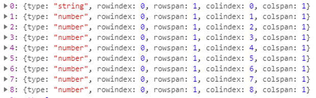
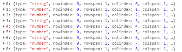 Check the type of each cell
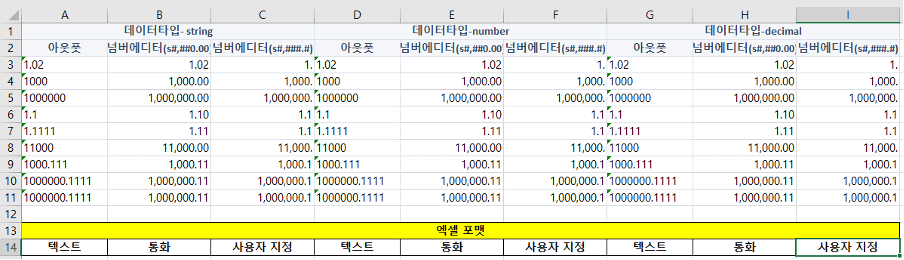 Check Excel
 -
applyFormat : true, useFormat : false
All cells are designated as 'Text', and . is not displayed after the number.
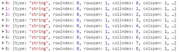 Check the type of each cell
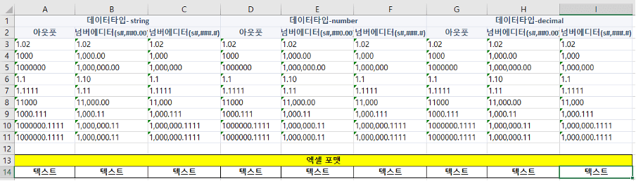 Check Excel
 -
applyFormat : false
Regardless of the value of the useFormat option, both the type and format are exported the same. (set data other than string type to ‘normal’)
 Check the type of each cell
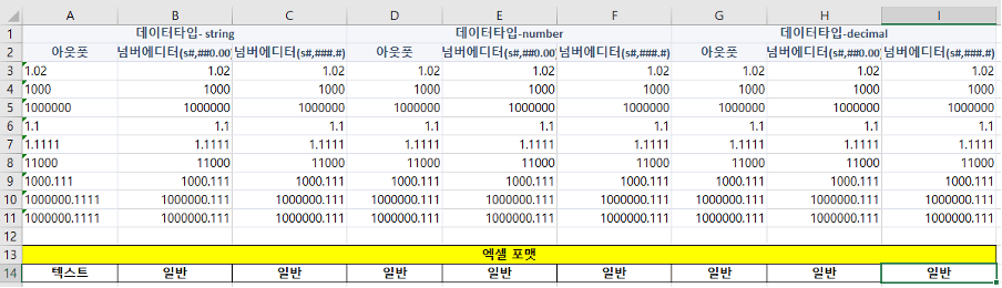 Check Excel
Apply Excel export style
Apply styles to cells when exporting grid data to Excel.
There is a way to export by specifying styles for controls and cells within a grid, and a method to export by specifying custom styles.
Supported styles are:
| Style | border-color, border-style, vertical-align, text-align, color, background-color, font-weight, font-size, font-family, font-style (italic only), text-decoration (underline only) |
Examples of using styling on controls within a grid
When importing data using the grid's getExportData API, the style specified for the control or cell in the grid can be exported, depending on the value set in the exceptStyle option.
var grid = app. lookup("grd1");
// output controls within the grid
var output = app. lookup("opt1");

// style the control
output.style.css("border", "red 1px solid");

// set the style to the first cell of the grid
grid.detail.getColumn(0).style.css("border", "blue 1px solid");

// Get the data with grid style applied in json format.
var exportData = grd.getExportData({

  //whether to exclude styles when exporting default true
  exceptStyle: false
});

// Submission settings are the same as the grid excel export example.
var submission = new cpr.protocols.Submission("sub_excelExport");

// Set the data including the style of the grid as request data.
submission.setRequestObject(exportData);

// Send data.
submission.send();
Examples of using custom styling
You can export data obtained with the getExportData API, including user-defined styles.
var grid = app. lookup("grd1");

// Get the grid data in json format.
var exportData = grd.getExportData();

// Get the detail cell style.
var detailStyles = exportData.rowgroups[1].style;

/*
Include the style defined below in all detail cells.
text-decoration: underline
font-style: italic
border-bottom-color: red
*/
for(var idx = 0; idx < detailStyles.length; idx++) {
	detailStyles[idx]["style"] = {
		"text-decoration" : "underline",
		"font-style" : "italic",
		"border-bottom-color" : "red"
	};
}

// Submission settings are the same as the grid excel export example.
var submission = new cpr.protocols.Submission("sub_excelExport");

// Set grid data including custom styles as request data.
submission.setRequestObject(exportData);

// Send data.
submission.send();
Relevant APIs: getExportData , Submission API 전체보기 , Submission.action , Submission.mediaType , Submission.responseType , Submission.setRequestObject , Submission.send , Grid API 전체보기
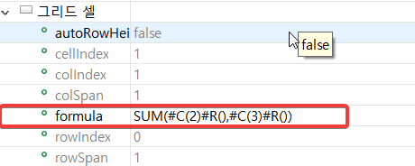
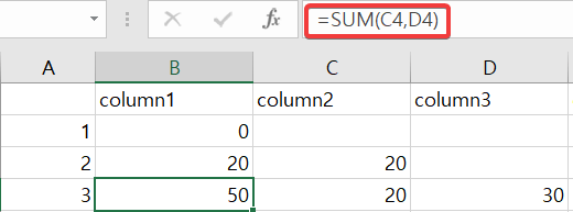
Using cell formula attributes
The formula property is a property that allows you to enter Excel function formulas into cells when exporting to Excel in the grid.
Function expression to be expressed in cells when exporting to Excel.
supported built-in functions:
#C(number?) Convert set cell index or current cell index to Excel column name
#R(number?) Use set row index or convert current row index to Excel row index
ex) SUM(#C(2)#R():#C(3)#R())
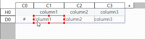
Merge cells (mergeToIndexExpr)
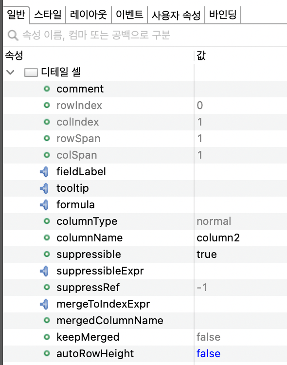
You can merge cells using mergeToIndexExpr and mergedColumnName properties of grid detail cells.
Multi-row, multi-column merging is possible by using the suppressible property of grid detail cells together.
- Dataset row data to bind
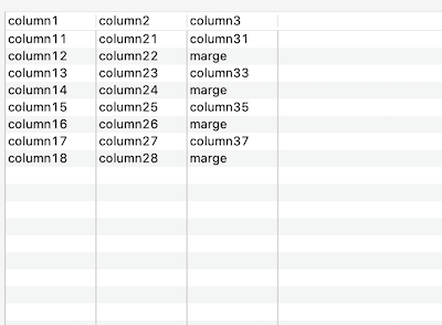
- Set the detail column after binding the dataset to the grid.
- Set the mergeToIndexExpr, mergedColumnName properties of the detail cells to be merged.
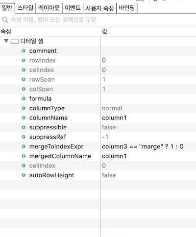
- Merge result
Components
| Attribute | Description | Related API |
|---|---|---|
| mergeToIndexExpr |
An expression that returns the index of the cell to be merged. The cell index returned as an expression execution result must be greater than the current cell index. When mergeToIndexExpr and suppressible are applied simultaneously and the values of the two properties are different, mergeToIndexExpr takes precedence. |
mergeToIndexExpr |
| mergedColumnName |
Dataset column name to be displayed in merged cells by mergeToIndexExpr property. The value of this property is ignored if no cell merging has taken place. |
mergedColumnName |
Constraints
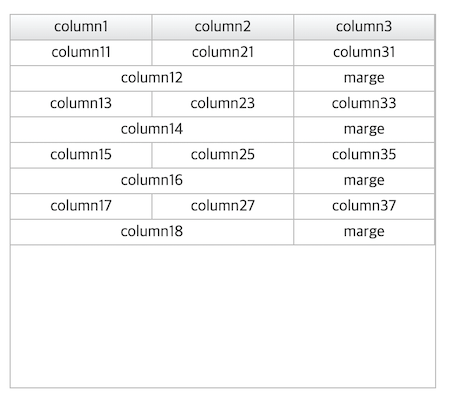
- The cell index of the mergeToIndexExpr property can only be set to a cell located to the right of the reference cell in the same row index.
-
The cells to be merged and the cells between them, including the cells to be merged, must exist in one area of the grid (when leftSplit, rightSplit properties are applied).
If cells with different rowspans are included between the cells you want to merge, they will not be merged.
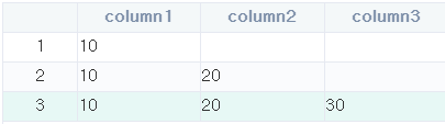
The cells to be merged (column4, column5) are not merged because the rowspan contains a different cell (column2). -
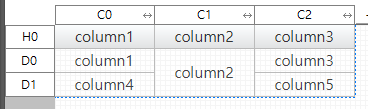
When moving cells, cells with cell indexes between merged cells must exist within the merged area. If it doesn't exist, it won't be merged.
grid.moveColumn(2, 1); // put the third cell after the first cell The cell (column3) with the cell index between the merged cells (column1, column2) does not exist in the merged area, so the merge is canceled.
-
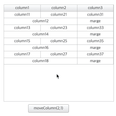
When moving cells, if there is a cell that is out of the cell index range between merged cells, it is not merged.

grid.moveColumn(0, 2); // put the first cell after the third cell Merging is canceled because there is a cell (column3) that is out of the cell index range between the cells being merged (column1, column2).
-
Notes when merging columns containing UDCs within a grid
Use the default value of Because it represents the columnName and mergedColumnName of the grid cell, You must delete the getText() function of UDC.
use custom value Using the return value of the UDC.getText() function
-
UDC publishes a property with the name "value" and makes it a bindable property.
-
Return using the published property app.getAppProperty("value") inside the getText() function.
-
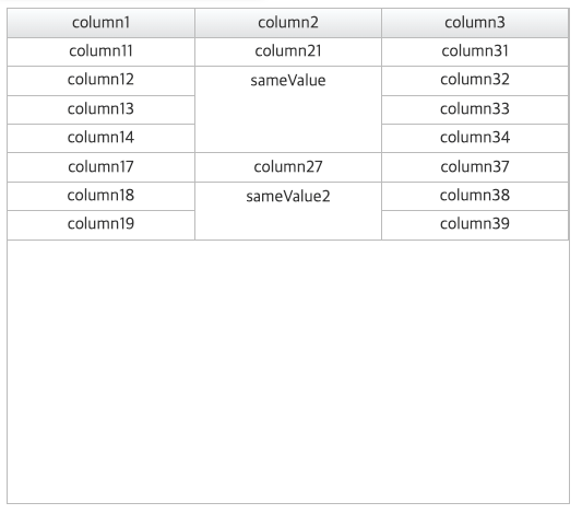
Merge cells (rows) (suppressible)
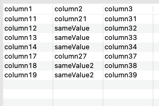
By using the suppressible property on grid detail cells, cells can be merged row by row.
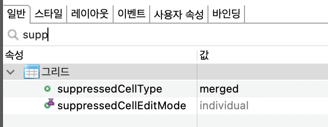
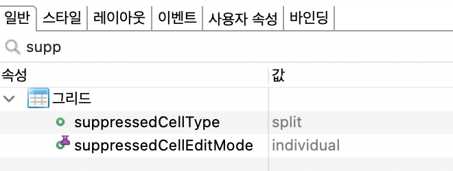
You can use the grid's suppressedCellType property to display merged cells as split or merged.
MergeToIndexExpr and mergedColumnName properties of grid detail cells can be used together to merge multiple rows and columns.
- Dataset row data to bind
- Set the detail column after binding the dataset to the grid.
Set the display method of the rows you want to merge into the grid with the value of the suppressedCellType property.
- suppressedCellType = merged
- suppressedCellType = split
- suppressedCellType = merged
- Set the suppressible property to true for the detail cells to be merged.
- row merge result
- suppressedCellType = merged
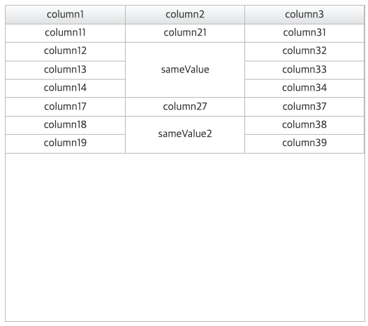
- suppressedCellType = split
- suppressedCellType = merged
Components
| Attribute | Description | Related API |
|---|---|---|
| suppressedCellType |
Determines whether to express suppressed detail cells in split or merged form [split]: When the same value is repeated, the value is printed only once and the remaining values are omitted. (default) [merged]: Provides the effect of merging cells with repeated values when the same value is repeated. |
suppressedCellType |
| suppressible |
Sets whether to hide text in cells that match the value of the immediately preceding row. If the detail line at design time is more than 2 lines, detail If you have rowSpan as many as the total number of rows, suppress is supported, Does not support suppress if it is in individual rows. For tree cells, only the lowest leaf node supports suppression when the level and value are the same. |
suppressible |
Constraints
The merged cell is located below the row in the element order, so the row style can be shown at the top.
If you need the background style specified in .cl-grid-row with cells merged in the grid (cell suppressible=true, grid suppressedCellType=merged), please set the transparency (rgba or opacity).
.cl-grid-row {
	&.cl-even-row {
		background-color: rgba(0, 0, 0, 0.35);
	}
}
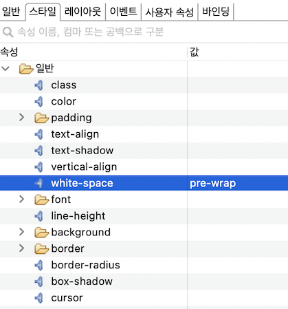
Wrap cell
Unlike cells that contain controls, the default cells of the grid do not have line breaks.
Here's how to set default cell line breaks.
How to set style properties inline
- In the grid editor, select the default cell to set line breaks.
- Set white-space: pre-wrap in the Properties View - Style tab.
How to set style properties using less files
@CHARSET "UTF-8";

.cl-grid .cl-grid-cell .cl-control.cl-default-cell {
	white-space: pre-wrap;
}
Use image map for grid filter popup checkbox
When using an image map for the grid filter pop-up checkbox, the width of .cl-checkbox-icon is maintained, and when the width of .cl-icon-wrapper is changed, the width of cl-text of the same depth must be changed as well. .
ex) .cl-checkbox-icon width: 13px, .cl-icon-wrapper width: 30px
Width: 100% of .cl-text must be changed to width: calc(100% - 30px); so that the width of .cl-icon-wrapper is displayed normally.
- .cl-icon-wrapper width: 30px , .cl-text width: 100%
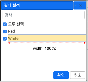
.cl-icon-wrapper area not displayed correctly - .cl-icon-wrapper width: 30px , .cl-text width: calc(100% - 30px)
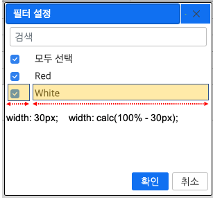
.cl-icon-wrapper area displayed correctly
CSS Example
@CHARSET "UTF-8";

/* Filter dialog - Area style that encloses checkboxes when using an image map */
.cl-gridfilter .cl-filterdlg .cl-filterdlg-itemlist .cl-filterdlg-item .cl-checkbox-wrapper{
	width: 30px;
}

/* filter dialog - item checkbox style */
.cl-gridfilter .cl-filterdlg .cl-filterdlg-itemlist .cl-filterdlg-item .cl-checkbox-icon {
	background-image: url("images/icon_checkbox_all.png");
	background-position: 0px 0px;
	background-size: auto;
	width: 13px;
	height: 13px;
	min-height: 13px;
}

/* Filter dialog - style when item checkbox is checked */
.cl-gridfilter .cl-filterdlg .cl-filterdlg-itemlist .cl-filterdlg-item &.cl-checked .cl-checkbox-icon {
	background-image: url("images/icon_checkbox_all.png");
	background-position: 0px -26px;
}

/* filter dialog - item text style */
.cl-gridfilter .cl-filterdlg .cl-filterdlg-itemlist .cl-filterdlg-item .cl-text {
	width: calc(100% - 30px);
	adding-left: 5px;
	overflow: hidden;
	text-overflow: ellipsis;
	white-space: nowrap;

	color: inherit;
	font: inherit;
	text-align: inherit;
	text-decoration: inherit;
	vertical-align: middle;
}