Input box
Control where you can input data.
You can do data input, print, and modification.
Configure the limited input from the user by using the filter.
It gains focus on the input box and allows input at the same time.
| Boundary | Key | Action |
|---|---|---|
| Text | Save the input box value | |
| Clear button | Delete the input box value | |
| Clear button | Delete the input box value |
Web accessibility
You should provide a label.
- Provide a label to the input box through configuring the fieldLabel property.
Case when the focus should be shifted to the clear button
-
You can shift the focus to the clear button by using the tab key, if you set the buttonFocusable property value as true.
| Operation method | Delete text | Delete value |
|---|---|---|
| Clear button click | O | X |
| Esc key input | O | X |
| Call clear() API | O | O |
| Press space key or enter key from the clear button | O | O |
Control component
Description on input box composition
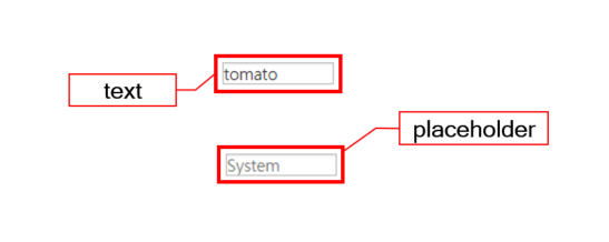
Component
| Component | Type | Description |
|---|---|---|
| text | String | Text shown in the input box. |
| placeholder | String | The input box description or a hint for the expected value. |
Example: Using the component
var inputBox_1 = app.lookup("ipb1");
inputBox_1.value = "tomatoSystem";

/* Configure description for input box or hint for the expected value */
inputBox_1.placeholder = "since 2000";

console.log(inputBox_1.text);
Style component
Input box can change font/font color and border thickness/border color.
Theme file: input.part.less
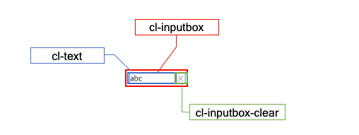
Component
| Component | Description |
|---|---|
| cl-inputbox | Input box style. |
| cl-text | Text style of the input box. |
| cl-inputbox-clear | Clear button style of the input box. |
Changing the style property by using the CSS file
@CHARSET "UTF-8";

/* Default input box */
.cl-inputbox {
	font: 11pt sans-serif;
	color: #333;
	border: 2px solid green;
}
Changing the style property by using the styler
var inputBox_1 = new cpr.controls.InputBox("ipb1");
inputBox_1.value = "tomatoSystem";

/* Default style of the input box */
/* (Multiple settings can be configured using JSON data.) */
inputBox_1.style.css({
	"color" : "red",
	"border" : "solid 2px green"
});

/* Clear button style of the input box */
inputBox_1.style.clear.css("backgruond-color", "red");

/* Default style of the input box(FOr single selection)  */
inputBox_1.style.css("color", "red");
Example
Creating input box
Example: Describing the input box creation.
var inputBox_1 = new cpr.controls.InputBox("ipb1");
inputBox_1.value = "Tomato System since 2000";

console.log(inputBox_1.value);
console.log(inputBox_1.text);

/* Setting input method for the password */
inputBox_1.secret = true;

/* Configuring whether to select entire data of the editing area, when focused. */
inputBox_1.autoSelect = true;
Related API: value , text , secret , autoSelect , InputBox API overview
Configuring the unit for the length of the String.
Input box can configure the unit to measure the length of the String.
char: String's length
utf8: Counting characters using UTF-8 encoding.
ascii: Default ascii code is calculated as 1byte and every other letters are calculated as 2byte.
var inputBox_1 = new cpr.controls.InputBox("ipb1");

/* Configure the unit to measure the length of the String of input box */
inputBox_1.lengthUnit = "utf8";

/* Input box length */
console.log(inputBox_1.length);
Related API: lengthUnit , length , InputBox API overview
Limited input
You can specify restricted input using regular expressions (regex) for the key values entered by the user.
var inputBox_1 = new cpr.controls.InputBox("ipb1");

/* Regular expression -> Lower case: [a-z], Upper case: [A-Z], Number: [0-9] */
inputBox_1.inputFilter = "[0-9]";
Related API: inputFilter , InputBox API overview
Designate selection
You can configure a block in a input box text.
var inputBox_1 = new cpr.controls.InputBox("ipb1");
inputBox_1.value = "tomatoSystem";

/* cursor(start, end, text) */
/* The cursor contains information about the starting position, ending position, and selected text of the text cursor  */
/* start: number, end: number, text: string */
inputBox_1.setSelection({
	start : 0,
	end : 6,
	text : "tomato"
});
Related API: setSelection , InputBox API overview
Display setting of the clear button
You can display a clear button in the input box based on the value of the showClearButton attribute. The default value is false. You can set an image for the clear button using the clearButtonImage attribute. The clear button will only be displayed when there is text in the input box.
var inputBox_1 = new cpr.controls.InputBox("ipb1");
//Configure clear button image
inputBox_1.clearButtonImage = "../tomato.png";

//Display clear button
inputBox_1.showClearButton = true;
Related API: clearButtonImage , showClearButton , InputBox API overview