Linked Combo Box
It is a combo-style control that allows selecting connected list-type data.
When the top-level data is selected, the sub-list of the selected data is displayed as items in the next combo box. The sub-list uses a dropdown-style list. When an item is selected, it is added to the value of the previously selected top-level item. When a top-level item is selected, all previously selected sub-items are removed, and the current selected value is updated.
The items in the linked combo box are composed of "value", "label", and "parentValue".
| Boundary | Key | Action |
|---|---|---|
| Combo box | Expand item list | |
| List | Shift below | |
| List | Shift below | |
| List | Select item | |
| Text | Copy |
Web accessibility
You should provide a label to each combo box.
- fieldLabels property will provide label to each combo box.
Control component
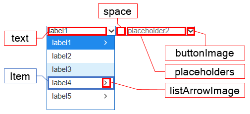
Explanation for the compositionof linked combo box screen
Component
| Component | Type | Description |
|---|---|---|
| text | String | Text shown in each combo box of the linked combo box. |
| space | String | Gap between the combo boxes of the linked combo boxes. |
| placeholders | String[] | Description or hint for the combo box of the linked combo box. |
| buttonImage | String | Button image for the combo box of the linked combo box. |
| listArrowImage | String | An arrow image for the list of the linked combo box. |
| TreeItem | cpr.controls.TreeItem | Items that are shown in the list of combo box. |
Example: Using the component
var linkedcombobox = app.lookup("lcb1");
linkedcombobox.placeholders = ["placeholder1", "placeholder2", "placeholder3"];
linkedcombobox.space = "10px";
linkedcombobox.buttonImage = "tomato.png";
linkedcombobox.listArrowImage = "./image/arrow.jpg";

/* Import every item of the linked list combo box.*/
var items = itemslinkedlistbox.getItems();
console.log(items[0]);						// {label: "label1", value: "value1", parentValue: "root"

/* Select an item with a '0' index from the linked combo box.*/
linkedcombobox.selectItem(0);
console.log(linkedcombobox.value);			// value1
Style component
Linked Combo Box: When a parent item is selected in the linked combo box, a child combo box with a corresponding sub-list appears. As the number of child items increases, the width of the list is evenly divided within the total width.
The linked combo box consists of a list and items. Separate classes are applied based on the items.
Theme file: linked-combo-box.part.less
Component
| Component | Description |
|---|---|
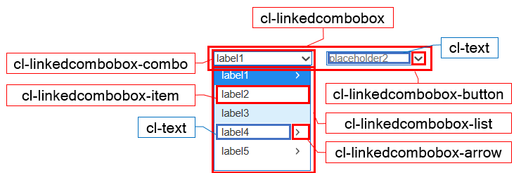
| cl-linkedcombobox | Overall style of the linked combo box. |
| cl-linkedcombobox-combo | Combo box style of the lniked combo box. |
| cl-linkedcombobox-button | Button style for the combo box of the linked combo box. |
| cl-linkedcombobox-list | List style for the item of the linked combo box. |
| cl-linkedcombobox-item | Item style of the linked combo box. |
| cl-linkedcombobox-arrow | Style of an arrow used to show the item with the sublist of the linked combo box. |
| cl-text | Text style for the text and item of the combo box, which is a component of the linked combo box. |
State element
| Component | State element | Description |
|---|---|---|
| cl-linkedcombobox-item | cl-selected | Style when selecting an item of the linked combo box. |
| cl-hover | Style for the mouse over of the linked combo box item. | |
| cl-disabled | Style for inactive status of the linked combo box item. | |
| cl-folder | Style for the item with the linked combo box's sublist. | |
| cl-leaf | Style for the item without the linked combo box's sublist |
Changing the style property by using the CSS file
@CHARSET "UTF-8";

/* Combo style of the linked combo box */
.cl-linkedcombobox .cl-linkedcombobox-combo {
  	border: 1px solid green;
  	background-color: gray;
}

/* Text style for the combo of the linked combo box */
.cl-linkedcombobox .cl-linkedcombobox-combo .cl-text {
  	color: red;
  	font: 11pt sans-serif;
}

/* Focus style of the linked combo box */
.cl-linkedcombobox.cl-focus .cl-linkedcombobox-combo {
  	border-color: yellow;
}

/* Background color for the item selected from the list of the linked combo box list */
.cl-linkedcombobox-list .cl-linkedcombobox-item.cl-selected {
	background-color: yellowgreen;
}
Component
| Component | Description |
|---|---|
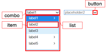
| combo | Styler for the combo box of the linked combo box. |
| button | Styler for the button of the combo box, which is a component of linked combo box. |
| list | Styler for the list of the combo box, which is a component of linked combo box. |
| item | Styler for the item of the combo box, which is a component of linked combo box. |
Changing the style property by using the styler
// UI Configuration
var linkedcombobox = app.lookup("lcb1");

/* Default style of the linked combo box */
/* (Multiple settings can be configured using JSON data.) */
linkedcombobox.style.css({
	"background-color": "green",
	"border": "2px solid red"
});

/* Default style of the linked combo box(For single selection) */
linkedcombobox.style.css("background-color", "green");

/* Style for the combo box of the linked combo box */
linkedcombobox.style.combo.css({
	"border": "2px solid blue"
});

/* Style for the button of the combo box inside the linked combo box */
linkedcombobox.style.button.css({
	"border": "1px solid purple"
});

/* Style for the list of the item inside the linked combo box */
linkedcombobox.style.list.css({
	"color" : "yellow"
});

/* Style for the item of the linked combo box*/
linkedcombobox.style.item.css({
	"background-color": "red"
});
Example
Linked combo box is a linked list-based data structure where selecting a parent item displays a child combo box with its corresponding items. Predefined data or data binding can be used to set the data for the Linked Combo Box.
var linkedcombobox_1 = new cpr.controls.LinkedComboBox("lcb1");

/* Configure preceding data */
var item_1 = new cpr.controls.TreeItem("pre_label1", "pre_value1", "root");
linkedcombobox_1.addItem(item_1);
linkedcombobox_1.addItem(new cpr.controls.TreeItem("pre_label2", "pre_value2", "root"));
linkedcombobox_1.addItem(new cpr.controls.TreeItem("pre_label3", "pre_value3", "pre_value1"));
linkedcombobox_1.addItem(new cpr.controls.TreeItem("pre_label4", "pre_value4", "pre_value1"));

/* Configure Dataset binding */
var dataset = new cpr.data.DataSet("ds1");
dataset.parseData({
	columns: [
		{name: "label"},
		{name: "value"},
		{name: "parent"}
	],
	rows: [
		{label: "label1", value: "value1", parent: "root"},
		{label: "label2", value: "value2", parent: "root"},
		{label: "label3", value: "value3", parent: "value1"},
		{label: "label4", value: "value4", parent: "value1"}
	]
});

linkedcombobox_1.setItemSet(dataset, {label: "label", value: "value", parentValue: "parent"});

console.log(linkedcombobox_1.getItems());
//[pre_value1, pre_value2, pre_value3, pre_value4, value1, value2, value3, value4]; Array of items
Related API: value , cpr.controls.TreeItem , addItem , setItemSet , getItems , LinkedComboBox API overview
Item selection and deselection
Linked ComboBox retains the value of the selected item as the current value. You can select a specific item by clicking on it or using the
var linkedComboBox_1 = new cpr.controls.LinkedComboBox("lcb1");

linkedComboBox_1.addItem(new cpr.controls.TreeItem("label1", "value1", "root"));
linkedComboBox_1.addItem(new cpr.controls.TreeItem("label2", "value2", "root"));
linkedComboBox_1.addItem(new cpr.controls.TreeItem("label3", "value3", "value1"));
linkedComboBox_1.addItem(new cpr.controls.TreeItem("label4", "value4", "value1"));

/* Select items with the index '0' and '2'.  */
linkedComboBox_1.selectItems([0, 2]));
console.log(linkedComboBox_1.value);				//value1, value3

/* Select items with the value 'value1' and 'value2'. */
var item1 = linkedComboBox_1.getItemByValue("value1");
var item2 = linkedComboBox_1.getItemByValue("value2");

linkedComboBox_1.selectItems([item1, item2]);
console.log(linkedComboBox_1.value);				//value1, value3
/* Deselect every selected items. */
linkedComboBox_1.clearSelection();
console.log(linkedComboBox_1.value);				//empty string
Related API: value , cpr.controls.MenuItem , cpr.controls.TreeItem , selectItem , selectItemByValue , selectItemByLabel , removeSelection , removeSelectionByValue , clearSelection , NavigationBar API overview
Use display expression
In Linked ComboBox, the text of the items can be formatted using the 'displayExp' property, which allows you to specify the expression format. The range of specification includes the item text in the top bar and the item text in the sub-list. The 'displayExp' property provides "label" and "value" as variables.
var linkedComboBox_1 = new cpr.controls.LinkedComboBox("lcb1");

linkedComboBox_1.addItem(new cpr.controls.TreeItem("label1", "value1", "root"));
linkedComboBox_1.addItem(new cpr.controls.TreeItem("label2", "value2", "root"));
linkedComboBox_1.addItem(new cpr.controls.TreeItem("label3", "value3", "value1"));
linkedComboBox_1.addItem(new cpr.controls.TreeItem("label4", "value4", "value1"));

/* Apply expression */
linkedComboBox_1.displayExp = "label + '[' + value + ']'";
/* Select the first item of the menu*/
linkedComboBox_1.selectItem(0);

console.log(menu_1.text);		//label1[value1]
Related API: value , text , cpr.controls.TreeItem , addItem , displayExp , selectItem , LinkedComboBox API overview