List box
It is a control for selecting a single value from a predefined set of values.
It is a control that displays a list of data. It allows selecting multiple items and shows the selected data. The values can be linked to a single value from a dataset.
The item of the list box is composed with "value" and "label".
| Boundary | Key | Action |
|---|---|---|
| List | Shift upwards | |
| List | Shift downwards | |
| List | Choose an item |
Web accessibility
You should provide a label.
- Provide a label to the list box by configuring the fieldLabel property.
Control component
Explanation for the composition of list box screen
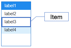
Component
| Component | Type | Description |
|---|---|---|
| Item | cpr.controls.Item | An item shown in the list box. |
Example: Using components
var list = app.lookup("list1");
/* Import every items of the list box. */
var items = list.getItems();
console.log(items[0]);  // { label: "label1", value: "value1" }

/* Select items with value 'value1' */
var item1 = list.getItemByValue("value1");
list.selectItem(item1);

/* Select items with the index '0'. */
list.selectItem(0);

console.log(list.value);  // value1
Style component
The list box is composed of items. Separate classes are applied based on the items.
Theme file: listbox.part.less
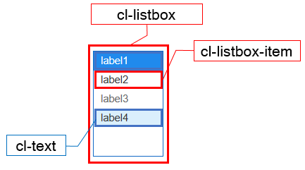
Component
| Component | Description |
|---|---|
| cl-listbox | Overall style of the list box. |
| cl-listbox-item | Style for the item of the list box. |
| cl-text | Style for the text of the list box. |
State element
| Component | State element | Description |
|---|---|---|
| cl-listbox-item | cl-selected | Style for selecting an item from the list box. |
| cl-disabled | Style when an item has been disabled from the list box. | |
| cl-hover | Style when an item has been hovered from the list box. |
Changing the style property by using the CSS file
@CHARSET "UTF-8";

/* Default style of the list box */
.cl-listbox {
  	background-color: gray;
  	border: 1px solid red;
}

/* Style for the focus of the list box */
.cl-listbox.cl-focus {
  	border: 1px solid green;
}

/* Style for the selected item from the list box */
.cl-listbox:not(.cl-disabled) .cl-listbox-item:not(.cl-disabled):not(.cl-selected):focus {
  background-color: black;
}

/* Background color of the selected item from the list box */
.cl-listbox .cl-lisbox-item.cl-selected {
	background-color: yellowgreen;
}

Component
| Component | Description |
|---|---|
| item | Styler that changes the style property of the item that is included in the list box. |
Changing the style property by using the styler
// UI Configuration
var listBox_1 = new cpr.controls.ListBox("lbx1");

/* Default style of the list box*/
/* (Multiple settings can be configured using JSON data.) */
listBox_1.style.css({
	"background-color": "green",
	"border": "2px solid red"
});

/* Default style of the list box(For single selection)*/
listBox_1.style.css("background-color": "green");

/* Style for the item of the list box*/
listBox_1.style.item.css({
	"color" : "yellow"
});
Example
The list box is composed of item-based list data. The data for the list box is set through pre-existing data or by binding to a dataset.
var listBox_1 = new cpr.controls.ListBox("lbx1");
/* Configure preceding data */
var item_1 = new cpr.controls.Item("pre_label1", "pre_value1");
listBox_1.addItem(item_1);
listBox_1.addItem(new cpr.controls.Item("pre_label2", "pre_value2"));

/* Configure binding for the DataSet*/
var dataset = new cpr.data.DataSet("ds1");
dataset.parseData({
	columns: [
		{name: "label"},
		{name: "value"}
	],
	rows: [
		{label: "label1", value: "value1"},
		{label: "label2", value: "value2"},
	]
});
listBox_1.setItemSet(dataset, {label: "label", value: "value"});

console.log(listBox_1.getItems());	// [pre_value1, pre_value2, value1, value2]; Array of items
Related API: value , cpr.controls.Item , addItem , setItemSet , ListBox API overview
Multiple selection of items
The list box allows for multiple item selection using the 'multiple' attribute. The selected items can be retrieved using 'getSelection()'. The value of the list box is determined by combining the 'value' of the multiple selected items based on the 'delimiter' attribute.
var listBox_1 = new cpr.controls.ListBox("lbx1");

listBox_1.addItem(new cpr.controls.Item("label1", "value1"));
listBox_1.addItem(new cpr.controls.Item("label2", "value2"));
listBox_1.addItem(new cpr.controls.Item("label3", "value3"));
listBox_1.addItem(new cpr.controls.Item("label4", "value4"));

/* Configure to allow multiple selection of items */
listBox_1.multiple = true;
/* Set a delimiter to distinguish 'value' during multiple selection */
listBox_1.delimiter = "/";

/* Select items with the value 'value3' and 'value4' */
var item1 = listBox_1.getItemByValue("value3");
var item2 = listBox_1.getItemByValue("value4");
listBox_1.selectItems([item1, item2]);

/* Select items with the index '0' and '2' */
listBox_1.selectItems([0, 2]);

console.log(listBox_1.getSelection());  // [value1, value3]; Array of items
console.log(listBox_1.value);  // value1/value3
console.log(listBox_1.values);  // [value1, value3]; Array of String
Related API: value , values , cpr.controls.Item , multiple , delimiter , selectItems , getSelection , ListBox API overview
Drag and drop event
The list box provides drag and drop events to allow moving items from one list box to another, whether it's the same or a different list box. It has related attributes such as 'allowDrop' and 'draggableItem'.
var listBox_1 = new cpr.controls.ListBox("lbx1");
var listBox_2 = new cpr.controls.ListBox("lbx2");

listBox_1.addItem(new cpr.controls.Item("label1", "value1"));
listBox_1.addItem(new cpr.controls.Item("label2", "value2"));
listBox_2.addItem(new cpr.controls.Item("label3", "value3"));
listBox_2.addItem(new cpr.controls.Item("label4", "value4"));

/* Configure to enable the ability to drag items */
listBox_1.draggableItem = true;
/* Configure to enable the ability to drop items */
listBox_2.allowDrop = true;
Related API: cpr.controls.Item , addItem , draggableItem , allowDrop , ListBox API overview
User definition of drag and drop(DataSet)
The drop event or dragover event provides default behavior. To ignore this behavior, please use event.preventDefault(). The following code customizes the drop action in a tree connected to a dataset.
var listBox_1 = new cpr.controls.Tree("lbx1");
/* Configure to enable the ability to drag items */
listBox_1.draggableItem = true;
/* Configure to enable the ability to drop items */
listBox_1.allowDrop = true
/* Connect item set to the list box */
listBox_1.setItemSet(app.lookup("ds1"),{label:"label",value:"value",icon:null,parentValue:"parentValue"});

/* Definition of drop event */
listBox_1.addEventListener("drop",function(e){
  var listbox = e.control;
  e.preventDefault();// Prevent default action(drop) of the list box.
  var sourceData = null;
  try{
    sourceData = JSON.parse(e.dataTransfer.getData("text")); // The dragged data can be imported using e.dataTransfer.getData("text").
  }catch(exception){
  }
  var canAction = sourceData && sourceData['from']; // Check if the dragged data is valid.
  if(!canAction){
    return;
  }

  var targetElement;
  if(!e.target.closest){ // Does not support closest IE (Seperate implementation required)
    return;
  }
  targetElement = e.target.closest("[role='option']");
  var after = true; // Check the position of the additional item to be added above or below the target item.
  if(targetElement != null){
    var rect = targetElement.getBoundingClientRect();
    var top = e.pageY - rect.top;
    var bottom = rect.top + rect.height - e.pageY;

    if(top < bottom){
      after = false;
    }

  }

  var targetItem = e.targetObject.item;
  var isSelf = sourceData.from.uuid == listbox.uuid; // Check if the dragged data is from the same control.
  var items = []; // Create an item from the dragged data.
  sourceData.content.forEach(function(each){
    var item = new cpr.controls.Item(each.label,each.value);
    items.push(item);
  });

  for(var i=0;i < items.length;i++){
    var each = items[i];
    //It cannot be added, if the item is brought from a different control and has the same value.
    if(isSelf == false && listbox.getItemByValue(each.value) != null){
      continue;
    }

    if(targetItem){
       if(isSelf == false){ // When dropping an item dragged from a different control, you can perform the following actions.
         if(after){
           var targetIndex = listbox.getIndex(targetItem);
           var row = listbox.dataSet.insertRow(targetIndex,true);
           row.setValue(listbox.itemSetConfig.label,each.label);
           row.setValue(listbox.itemSetConfig.value,each.value);
           targetItem = each;
         }else{
           var targetIndex = listbox.getIndex(targetItem);
           var row = listbox.dataSet.insertRow(targetIndex,false);
           row.setValue(listbox.itemSetConfig.label,each.label);
           row.setValue(listbox.itemSetConfig.value,each.value);
         }
       }else{ // When dropping an item dragged from the same control, you can handle the following scenario.
         if(after){
           var sourceIndex = listbox.getIndex(each);
           var targetIndex = listbox.getIndex(targetItem);
           var row = listbox.dataSet.getRow(sourceIndex);
           row.setValue(listbox.itemSetConfig.label,each.label);
           row.setValue(listbox.itemSetConfig.value,each.value);
           listbox.dataSet.moveRowIndex(sourceIndex,targetIndex,true);
           targetItem = each; // When multiple items are being moved, you need to change the reference item.
         }else{
           var sourceIndex = listbox.getIndex(each);
           var targetIndex = listbox.getIndex(targetItem);
           var row = listbox.dataSet.getRow(sourceIndex);
           row.setValue(listbox.itemSetConfig.label,each.label);
           row.setValue(listbox.itemSetConfig.value,each.value);
           listbox.dataSet.moveRowIndex(sourceIndex,targetIndex,false);
         }
      }
    }else{
      if(isSelf == false){
        listbox.addItem(each);
      }
    }
  }
  listbox.redraw();
});
Related API: cpr.controls.Item , itemSetConfig , dataSet , getItemByValue , ListBox API overview