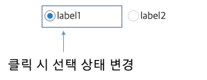
Radio button
It is a control that allows selecting only one option among multiple choices.
It is a control characterized by multiple radio buttons used as a group for one option. Only one radio button within the same group can be selected. When a radio button is selected by the user, all other radio buttons within the same group are deselected.
The items displayed on the radio buttons can be composed of two types.
1. Preceding data : Configure the fixed item.
2. Binding : Bind with the DataSet.
| Boundary | Key | Action |
|---|---|---|
| Item | Shift upwards | |
| Item | Shift downwards | |
| Item | Shift left | |
| Item | Shift right |
Control component
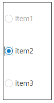
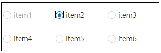
Explanation on the composition of radio button screen

| Flow layout format design (colCount=-1) | Vertical design (colCount=1) | Multi-line design (colCount=3) |
|---|---|---|
 |
 |
 |
Component
| Component | Type | Description |
|---|---|---|
| Item | cpr.controls.Item | Item of the radio button. |
Example: Using the component
var radioButton_1 = app.lookup("rdb1");
var item = radioButton_1.getItem(1);
item.label = "test2";
item.value = "test2";

radioButton_1.value = "test2";
Style component
Theme file: radio-button.part.less

Component
| Component | Description |
|---|---|
| cl-radiobutton | Radio button style. |
| cl-radiobutton-item | Style for the item of the radio button. |
| cl-radiobutton-field |
Style for area combining icon and text of the radio button. The selection status of the icon will change if you click the following area. |
| cl-icon-wrapper | Style for the area that surrounds the internal icon of the radio button. |
| cl-radiobutton-icon | Style for the internal icon of the radio button. |
| cl-text | Style for the internal text of the radio button. |
State element
| Component | State element | Description |
|---|---|---|
| cl-radiobutton-item | cl-selected | Style when a radio button item is selected. |
| cl-disabled | Style when a radio button item is disabled. | |
| cl-radiobutton-icon | cl-selected | Style when the icon of a radio button item is selected. |
Changing the style property by using the CSS file
@CHARSET "UTF-8";

/* Icon style when a radio button item has been selected */
.cl-radiobutton .cl-radiobutton-item.cl-selected .cl-radiobutton-icon {
	background-image: url(icons/radio-focus-selected.png);
}

/* Text style when the radio button is disabled */
.cl-radiobutton.cl-disabled .cl-text {
	color: #666;
}

/* Icon style for the selected item when the radio button is disabled */
.cl-radiobutton.cl-disabled .cl-radiobutton-item.cl-selected .cl-radiobutton-icon {
	background-image: url(icons/radio-disabled-focus-selected.png);
}
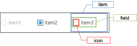
Component
| Component | Description |
|---|---|
| item | Styler for the itme of the radio button. |
| icon | Styler for the internal icon of the radio button item. |
| field | Styler for the area that combines the internal icon and the text of the radio button item. |
Changing the style property by using the styler
var radioButton_1 = app.lookup("rdb1");
/* Default style of the radio button (Multiple settings can be configured using JSON data.) */
radioButton_1.style.css({
	"border": "2px solid red",
	"background-color": "yellow"
});

/* Default style of the radio button (When setting a single style, you can configure it as follows.) */
radioButton_1.style.css("border", "2px solid blue");

/* Style for the item of the radio button */
radioButton_1.style.item.css({
	"border": "2px solid red"
});

/* Style for the icon of the radio button */
radioButton_1.style.icon.css({
	"border": "2px solid red"
});

/* Style for the area that combines the text and the icon of the radio button */
radioButton_1.style.field.css({
	"background-color": "pink"
});
Example
Creating a radio button
Example: Creating radio button by using the preceding data.
var radioButton_1 = new cpr.controls.RadioButton("rdb1");
radioButton_1.addItem(new cpr.controls.Item("item1", "value1"));
radioButton_1.addItem(new cpr.controls.Item("item2", "value2"));
radioButton_1.addItem(new cpr.controls.Item("item3", "value3"));

radioButton_1.value = "value3";
Related API: value , cpr.controls.Item , addItem , RadioButton API overview
Configuring radio button layout
The layout of the radio button is in table structure. You can configure the desired horizontal size(column count).
var radioButton_1 = new cpr.controls.RadioButton("rdb1");
radioButton_1.addItem(new cpr.controls.Item("item1", "value1"));
radioButton_1.addItem(new cpr.controls.Item("item2", "value2"));
radioButton_1.addItem(new cpr.controls.Item("item3", "value3"));

/* The radio buttons have been set with a horizontal size (column count) of 3. */
radioButton_1.colCount = 3;
Related API: cpr.controls.Item , addItem , colCount , RadioButton API overview
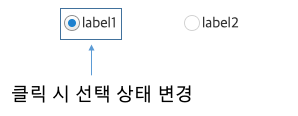
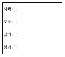
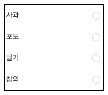
Radio button item icon selection area
Clicking on the .cl-radiobutton-field area will toggle the selection state by default
If there is spacing between the icon and the text area, you can apply the following CSS to ensure that clicking on the spacing also toggles the checked state.
radio-button.part.less@CHARSET "UTF-8";
/* Select and deselect the item when clicking on the whitespace */
.cl-radiobutton .cl-radiobutton-field {
width: 100%;
}Compare before and after applying the CSS
-
Before applying CSS
-
After applying CSS
Align the radio button icon on the right
When the iconAlign property value is set to "right," you can align the radio button icon to the right of the item label.
var radioButton_1 = new cpr.controls.RadioButton("rdb1");
radioButton_1.addItem(new cpr.controls.Item("Apple", "value1"));
radioButton_1.addItem(new cpr.controls.Item("Grape", "value2"));
radioButton_1.addItem(new cpr.controls.Item("Strawberry", "value3"));
radioButton_1.addItem(new cpr.controls.Item("Korean melon", "value4"));

/* The radio button's horizontal size (column count) has been set to 1. */
radioButton_1.colCount = 1;

/* Right-aligned radio button icon */
radioButton_1.iconAlign = "right";
If you want to align the radio button icon to the right end of the item, you will need the following CSS settings.
radio-button.part.less@CHARSET "UTF-8";
.cl-radiobutton .cl-radiobutton-field {
width: 100%;
}
.cl-radiobutton .cl-radiobutton-field .cl-text{
width: 100%;
}
-
Before applying CSS
-
After applying CSS
Related API: cpr.controls.Item , iconAlign , colCount , RadioButton API overview