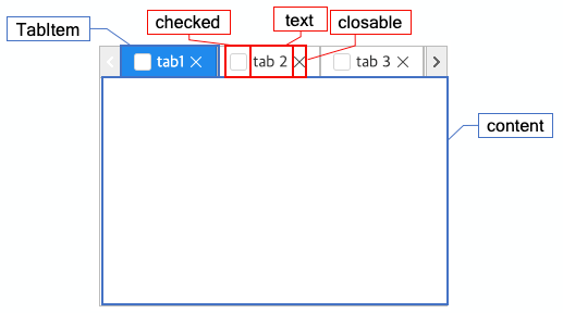
Tab folder
This is a control that displays a single page selected by the user from multiple pages.
A tab folder consists of tab items. The content of each tab item displays the layout of the selected item.
Web accessibility
You need to set the title of each tab item to display the title of the page shown in that tab.
You have to provide a label.
-
Configure the fieldLabel property and provide a label to the tab folder.
Example
var tabfolder = app.lookup("tab1");

tabfolder.fieldLabel = "There are 3 tabs.";
Please consider adding the following information if it is required for web accessibility evaluation.
You should provide explanations for keyboard operation using the itemDisplayExp in the tab folder.
cl-sound-only" is a class name used to hide the text and provide only audio feedback.
-
Example: writing the script
var tabfolder = app.lookup("tab1");

// cl-sound-only" is a class name to be added to the text element generated as the first argument of the "sstr" function.
tabfolder.itemDisplayExp = "sstr('Shift between the tab pages by using the left and right arrow key. ', ['cl-sound-only']) + text ";
Key action depending on the value of the selectionFollowsFocus property
| Boundary | Key | Action |
|---|---|---|
| Tab item | Select the left tab item | |
| Tab item | Select the right tab item | |
| Tab item | Select the tab item | |
| Checkbox of the tab item | Select or deselect the checkbox. | |
| Header | Shift the focus among the header control |
| Boundary | Key | Action |
|---|---|---|
| Tab item | Shift to the left tab item | |
| Tab item | Shift to the right tab item | |
| Tab item | Select the tab item | |
| Tab item | Select the tab item | |
| Checkbox of the tab item | Select or deselect the checkbox. | |
| Header | Shift the focus among the header control |
Control component
Description of the tab folder screen composition
Component
| Component | Type | Description |
|---|---|---|
| Item | cpr.controls.TabItem | Tab item of the tab folder. |
| text | String | Title of the tab item. |
| closable | boolean | It indicates whether the close button should be displayed on the tab item. |
| checked | boolean | It indicates whether the checkbox should be displayed on the tab item. |
| content | cpr.controls.UIControl | A group or a control that is inside the tab item. |
Example: Using the components
var tabfolder = app.lookup("tab1");
var item = new cpr.controls.TabItem();
item.text = "tab1";
item.closable = true;
item.content = app.lookup("group1");

/* Add the following item into the tab item. */
tabfolder.addTabItem(item);
/* Select the following item. */
tabfolder.setSelectedTabItem(item);
Style component
The tab folder reflects the content based on the selected item.
Theme file: tabfolder.part.less
Component
| Component | Description |
|---|---|
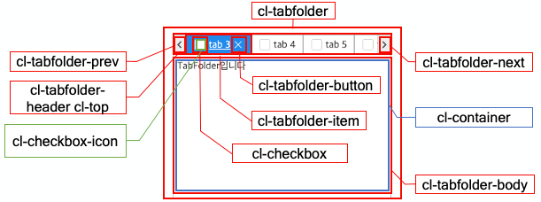
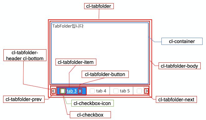
| cl-tabfolder | The overall style of the tab folder. |
| cl-tabfolder-header | The style of the header, including the tab items. |
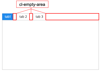
| cl-empty-area | The style of the spacing between tab items and the empty space in the tab header area. |
| cl-tabfolder-prev | The style of the button that allows navigation to the previous item when the tab items exceed the allowed width of the tab folder. |
| cl-tabfolder-next | The style of the button that allows navigation to the next item when the tab items exceed the allowed width of the tab folder. |
| cl-tabfolder-item | Style of the tab item. |
| cl-text | Text style of the tab item. |
| cl-checkbox | Checkbox style of the tab item. |
| cl-checkbox-icon | Icon style of the checkbox of the tab item. |
| cl-tabfolder-button | Close-button style of the tab item. |
| cl-tabfolder-body | Body style of the selected item in the tab folder. |
| cl-container | Layout style of the selected item in the tab folder. |
State element
| Component | State element | Description |
|---|---|---|
| cl-tabfolder-prev | cl-disabled | The style of the button that moves to the previous item when it is disabled. |
| cl-tabfolder-next | cl-disabled | The style of the button that moves to the next item when it is disabled. |
| cl-tabfolder-item | cl-disabled | The style of the tab item when it is disabled.. |
| cl-selected | The style of the tab item when it is selected. | |
| cl-checkbox | cl-checked | The style of the tab item when its checkbox is checked. |
| cl-tabfolder-header | cl-top | The style of the header, including the tab items, when the headerPosition attribute is set to "top". |
| cl-bottom | The style of the header, including the tab items, when the headerPosition attribute is set to "bottom". |
Changing style property by using the CSS file
@CHARSET "UTF-8";
/* Default style of the tab folder*/
.cl-tabfolder {
	color: red;
}

/* Style of the button that shifts to the previous item */
.cl-tabfolder .cl-tabfolder-prev{
	cursor: pointer;
}

/* Style of the button that shifts to the next item */
.cl-tabfolder .cl-tabfolder-next {
	background-color: blue;
}

/* Header style of the tab item */
.cl-tabfolder .cl-tabfolder-header .cl-unselectable{
	border: 2px solid red;
}

/* Style of the tab item */
.cl-tabfolder .cl-tabfolder-item{
	background-color: green;
}

/* Style when the tab item is selected */
.cl-tabfolder-item .cl-selected{
	font-weight: bold;
}

/* Checkbox of the tab item */
.cl-tabfolder-item .cl-checkbox {
	background-color: red;
}
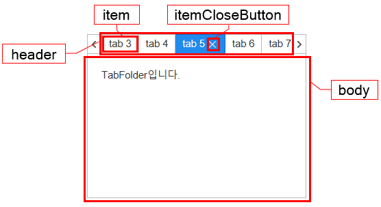
Component
| Component | Description |
|---|---|
| item | The tab item styler for the tab folder. |
| itemCloseButton | Styler of the tab item's close button for the tab folder. |
| header | Header styler of the tab folder. |
| body | Body styler of the tab folder. |
Changing the style property by using the styler
// UI Configuration
var tabfolder_1 = new cpr.controls.TabFolder("tab1");

/* Tab folder style */
/* (You can use JSON data to configure multiple settings.) */
tabfolder_1.style.css({
	"color" : "red"
});

/* Default style of tab folder (For single selection)*/
tabfolder_1.style("padding", "2px");

/* Header style of the tab folder*/
tabfolder_1.style.header.css({
	"border": "2px solid blue"
});

/* Tab item style of the tab folder */
tabfolder_1.style.item.css({
	"background-color": "green"
});

/* Close button style of the tab item in the tab folder */
tabfolder_1.style.itemCloseButton.css({
	"border": "1px solid purple"
});

/* Body style of the tab folder */
tabfolder_1.style.body.css({
	"background-color": "red"
});
Example
The tab items in the tab folder are organized as a single group. When a tab item is clicked, it is selected, and the content of the selected item is displayed.
var tabfolder_1 = new cpr.controls.TabFolder("tab1");
var item = new cpr.controls.TabItem();
item.text = "tab1";
item.closable = true;
item.content = app.lookup("group1");

var item2 = new cpr.controls.TabItem();
item2.text = "tab2";
item2.closable = true;
item2.content = app.lookup("group2");

var item3 = new cpr.controls.TabItem();
item3.text = "tab3";
item3.closable = true;
item3.content = app.lookup("group3");

/* Add the following item.*/
tabfolder_1.addTabItem(item);
tabfolder_1.addTabItem(item2);
tabfolder_1.addTabItem(item3);

/* Select the first item. */
tabfolder_1.setSelectTabItem(item);

console.log(tabfolder_1.getSelectedTabItem());		//tab item of tab1

/* Delete the item with the id '0'. */
tabfolder_1.removeTabItem(tabFolder_1.getTabItems()[0]);
console.log(tabfolder_1.getTabItems());				//tab item array of tab2 and tab3
Related API: cpr.controls.TabItem , text , closable , content , addTabItem , setSelectTabItem , removeTabItem , getTabItems , TabFolder API overview
Closing the tab item
To close a tab item, you can either click on the close button located on the right side of the item or use the provided API. The close button is displayed if the 'closable' attribute is set to "true", and if the tab folder's 'showCloseOnlyActive' attribute is set to "true", only the selected tab item will have the close button visible. You can use the 'closeAll()' and 'closeOther()' methods through the API to close tab items.
var tabfolder_1 = new cpr.controls.TabFolder("tab1");
var item = new cpr.controls.TabItem();
item.text = "tab1";
item.closable = true;
item.content = app.lookup("group1");

var item2 = new cpr.controls.TabItem();
item2.text = "tab2";
item2.closable = true;
item2.content = app.lookup("group2");

var item3 = new cpr.controls.TabItem();
item3.text = "tab3";
item3.closable = true;
item3.content = app.lookup("group3");

tabfolder_1.addTabItem(item);
tabfolder_1.addTabItem(item2);
tabfolder_1.addTabItem(item3);

tabfolder_1.showCloseOnlyActive = true;

/* Close every tab item. */
tabfolder_1.closeAll();

/* Close every item except for some specific tab items. */
tabfolder_1.closeOthers(item);
Related API: cpr.controls.TabItem , text , closable , content , addTabItem , showCloseOnlyActive , closeAll , closeOthers , TabFolder API overview
Context Menu
You can construct a menu using the contextmenu event, and you can retrieve the item corresponding to the mouse pointer using event.targetObject.item.
// new cpr.controls.TabFolder("tab1") Omit creation...
tabfolder_1.addEventListener("contextmenu",function(/* cpr.events.CMouseEvent */ e){

  //Prevent system context menu.
  e.preventDefault();

  var targetItem = e.targetObject.item; //Retrieve the tab item corresponding to the mouse pointer.
  var menu = new cpr.controls.Menu("ctxmenu"); // Create a menu.

  // blur event handler.
  menu.addEventListener("blur", function(e) {
  	// Delete objects that are included in the control\.
  	menu.dispose();
  });
  // Handler for the circumstance when the menu has been selected.
  menu.addEventListener("selection-change", function(e) {
  	//Delete objects that are included in the control.
  	menu.dispose();

  	var newSelection = e.newSelection[0];
  	var tabFolder = app.lookup("tab1");

  	if (newSelection.label == "Close every tab") {
  		tabFolder.closeAll();
  	}
  	if (newSelection.label == "Close another tab") {
  		tabFolder.closeOthers(targetItem);
  	}
  });

  //Menu composition based on the button and the header of the tab folder
  if (targetItem) {
  	// Item of contextmenu.
  	(function(ctxmenu) {
  		ctxmenu.addItem(new cpr.controls.MenuItem("Close other tab", "value1", ""));
  		ctxmenu.addItem(new cpr.controls.MenuItem("Close every tab", "value2", ""));
  	})(menu);
  } else {
  	// Item of contextmenu.
  	(function(ctxmenu) {
  		ctxmenu.addItem(new cpr.controls.MenuItem("Close every tab", "value2", ""));
  	})(menu);
  }

  //Adjust the menu to be positioned at the mouse pointer.
  var appRect = app.getActualRect();
  menu.style.css({
  	position: "absolute",
  	top: "" + (e.clientY - appRect.top) + "px",
  	left: "" + (e.clientX - appRect.left) + "px",
  	width: "180px"
  });
  //Set the control to the topmost position.
  app.floatControl(menu);

  //Assign a focus to ensure that it can disappear when blurred.
  menu.focus();
}); // contextmenu event
Related API: cpr.controls.TabItem , text , closable , content , addTabItem , showCloseOnlyActive , closeAll , closeOthers , contextmenu , floatControl , TabFolder API overview