Tree
A Control that represents data in a tree structure.
Clicking on the icon located in front of an item expands or collapses the sub-list. The value can be linked to the value of one dataset.
Tree's items are composed with "value", "label", and "parentValue".
※ Property difference of showItemCheckbox and showSelectionCheckbox
- showItemCheckbox : It sets whether to display a checkbox for indicating the checked state of an item.
(The checkbox is not related to item selection when it is checked.)
- showSelectionCheckbox : You can configure whether to display a checkbox for indicating the selected state of an item.
(An item gets selected whene the checkbox get checked.)
Web accessibility
-
Provide a label to the tree by configuring the fieldLabel property.
tree.fieldLabel= "Choose a country"; Case when you need to provide expand/collapse functionality using the spacebar or enter key
For parent items that have child items, you can provide the option to expand/collapse when they are selected.You can perform the expand/collapse functionality on parent items using the space bar or enter key, and due to the toggle feature, you cannot make a selection. You can configure this functionality using the following events: "before-selection-change" and "item-click" events.
Example
/*
 * Call when the item-click event occurs in the tree.
 * An event that occur when the item is clicked.
 */
function onTre1ItemClick( /* cpr.events.CItemEvent */ e) {
	/**
	 * @type cpr.controls.Tree
	 */
	var tre1 = e.control;
	tre1.toggle(e.item);
}

/*
 * Call when the before-selection-change event occurs in the tree.
 * An event that happens before the selected item value gets saved. selection-change to the next event will occur.
 */
function onTre1BeforeSelectionChange(/* cpr.events.CSelectionEvent */ e){
	/**
	 * @type cpr.controls.Tree
	 */
	var tre1 = e.control;
	var item = e.newSelection[0];
	e.newSelection.forEach(function(each){
		if(each.children.length>0){
			e.preventDefault();
			return;
		}
	})
}
| Boundary | Key | Action |
|---|---|---|
| Tree | Shift upward | |
| Tree | Shift downward | |
| Tree | Collapse expanded sublist | |
| Tree | Expand collapsed sublist | |
| Tree | Item selection when showItemCheckbox=false | |
| Tree | Checkbox selection when showItemCheckbox=true |
Control component
Description on the composition of the tree screen
Component
| Component | Type | Description |
|---|---|---|
| TreeItem | cpr.controls.TreeItem | Item that is displayed on the tree. |
| expandImage | String | Icon image for expanded state of tree item sublist. |
| collapseImage | String | Icon image for collapsed state of tree item sublist. |
| folderImage | String | Icon image for the tree item that have the sublist. |
| leafImage | String | Icon image for the tree item that does not have the sublist. |
| badgeExp | Expression | The text written in an expression and displayed on the right side of a tree item. |
| showSelectionCheckbox | Boolean | The expression property of the checkbox, which is getting checked when the tree item is selected. |
| showItemCheckbox | Boolean | The expression property of the checkbox that checks the tree item. |
| showLines | Boolean | A property that displays the line on the tree. |
Example: using the components
var tree = app.lookup("tre1");
tree.expandImage = "./expand.png";
tree.collapseImage = "./collapse.png";
tree.folderImage = "./folder.png";
tree.leafImage = "./leaf.png";
tree.showSelectionCheckbox = false;
tree.showItemCheckbox = true;
tree.showLines = true;

/* Import every items of the tree.*/
var items = tree.getItems();
console.log(items[0]); //{label: "label1", value: "value1", parentValue: "root"}

/* Select the index 0 item of the tree. */
tree.selectItem(0);
console.log(tree.value); // value1

/* Check the tree's items.*/
tree.setChecked(items[0],true);
Style component
When you click the icon at the beginning of an item in the tree, you can expand or collapse the item's list. This icon is shown for items that have sub-lists. If the 'multiple' attribute of the tree is set to "true" and the showSelectionCheckbox has its default value, a checkbox is displayed in front of the folder icon of the tree item. The parent items that include the selected items in their sub-lists are separately indicated on the checkboxes.
Theme file: tree.part.less
Component
| Component | Description |
|---|---|
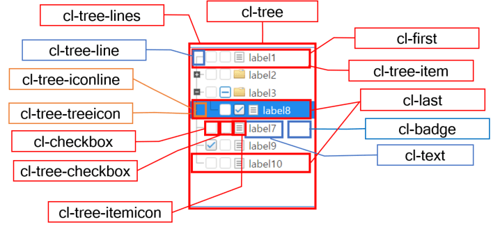
| cl-tree | Overall style of the tree. |
| cl-tree-item | Style of the tree item. |
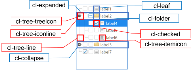
| cl-tree-itemicon | Style of the icon of the tree item. If there are sub-items in the combination of "cl-folder, cl-leaf," a folder image is displayed, otherwise a file image is displayed. |
| cl-checkbox | Style of the checkbox of the tree item. Display the checkbox if the 'showItemCheckbox' property is true. |
| cl-tree-checkbox | Style of the checkbox of the tree selection item. It will display the checkbox that check the selected item if "showSelectionCheckbox" property is true, or if "multiple" property is true and "showSelectionCheckbox" property is default. |
| cl-tree-treeicon | An icon style that represents the expansion or collapse of sub-items in a tree item. Depending on the state, it shows the expanded icon image or the collapsed icon image using the combination of "cl-expanded, cl-collapse.". |
| cl-tree-lines | Display a line on the node if the tree's 'showLines' property is true. |
| cl-iconline | Style of the line displayed at the beginning of each sub-item in the tree, if the 'showLines' property of the tree is set to true. |
| cl-line | Style of the line for the items, if the 'showLines' property of the tree is set to true, |
| cl-first | Style of the first item, if the 'showLines' property of the tree is set to true |
| cl-last | Style of the last item among the child items and the last item among all the items, if the 'showLines' property of the tree is set to true. |
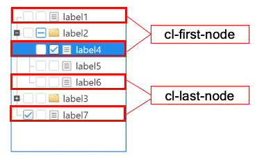
| cl-first-node | This is the style of the first node item among all the items. |
| cl-last-node | Style of the last node item among all the items. |
| cl-badge | Style of the text with an expression type appearing on the right side of the tree item. |
Component
| Component | Status element | Description |
|---|---|---|
| cl-tree-item | cl-hover | Style when the tree item is hovered. |
| cl-selected | Style when the tree's item is selected. | |
| cl-disabled | Style when the tree's item is disabled. | |
| cl-expanded | Style of the tree item with the expanded state of its sublist. | |
| cl-collapse | Style of the tree item with the collapsed state of its sublist | |
| cl-folder | Style of the tree item with the sublist. | |
| cl-leaf | Style of the tree item without the sublist. | |
| cl-checked | Item style when showSelectionCheckbox is at checked status. |
Changing the style property by using the CSS file
@CHARSET "UTF-8";

/* Default style of the tree */
.cl-tree{
	border: red;
	color: green;
	background-color: gray;
}

/* Icon image of the tree */
.cl-tree .cl-tree-item .cl-tree-itemicon{
	width: 20px;
	background-image: url(icons/tree-file.png);
}

/* Item's background color that has been selected by the tree */
.cl-tree .cl-tree-item.cl-selected {
	background-color: yellowgreen;
}

/* Focus style of the tree */
.cl-tree.cl-focus{
	border-color: red;
}

/* Disabled style of the tree */
.cl-tree.cl-disabled{
	color: #666;
	border-color: #ddd;
}

/* Line style of the tree*/
.cl-tree .cl-tree-item .cl-tree-line {
	background-color: "blue";
}
Component
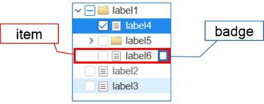
| Component | Description |
|---|---|
| item | Styler of the tree item. |
| badge | Styler of the badge of the tree item. |
Changing the style property by using the styler
// UI Configuration
var tree_1 = new cpr.controls.Tree("cmb1");

/* Default style of the tree*/
/* (You can configure multiple settings using JSON data.) */
tree_1.style.css({
	"background-color": "green",
	"border": "2px soild red"
});

/* Default style of the tree(For single selection))*/
tree_1.style.css("background-color": "green");

/* Tree's item style*/
tree_1.style.item.css({
	"color" : "yellow"
});
Example
The tree is composed of hierarchical data where the arrow icon of an item can be clicked to expand or collapse its child items. You can create pre-existing data or bind a data set to configure the tree's data..
var tree = new cpr.controls.Tree("tre1");
/* Configure pre-existing data */
var item_1 = new cpr.controls.TreeItem("pre_label1", "pre_value1", "root");
tree.addItem(item_1);
tree.addItem(new cpr.controls.TreeItem("pre_label2", "pre_value2", "root"));
tree.addItem(new cpr.controls.TreeItem("pre_label3", "pre_value3", "pre_value1"));
tree.addItem(new cpr.controls.TreeItem("pre_label4", "pre_value4", "pre_value1"));

/* Binding configuration of the dataset  */
var dataset = new cpr.data.DataSet("ds1");
dataset.parseData({
	columns: [
		{name: "label"},
		{name: "value"},
		{name: "icon"},
		{name: "parent"}
	],
	rows: [
		{label: "label1", value: "value1", icon: "./tomato.jpg", parent: "root"},
		{label: "label2", value: "value2", icon: "", parent: "root"},
		{label: "label3", value: "value3", icon: "", parent: "value1"},
		{label: "label4", value: "value4", icon: "./tomatoSystem.jpg", parent: "value1"}
	]
});

tree.setItemSet(dataset, {label: "label", value: "value", icon: "icon", parentValue: "parent"});
tree.redraw(); //Update tree

console.log(tree.getItems());
//[pre_value1, pre_value2, pre_value3, pre_value4, value1, value2, value3, value4]; Array of items
Related API: value , cpr.controls.TreeItem , addItem , setItemSet , redraw , getItems , Tree API overview
Either collapsing or expandning the tree item.
After creating the tree, all items are initially collapsed when loaded. You can use 'expandAllItems()' or 'expandItem()' to expand all items or expand the sub-list of a specific item. Similarly, 'collapseAllItems()' or 'collapseItem()' can be used to collapse all items or collapse the sub-list of a specific item. Additionally, you can use the 'autoOpen' attribute to expand the tree to the desired depth when loaded. When using the expand and collapse methods, the 'node-open' and 'node-close' events are triggered.
var tree_1 = new cpr.controls.Tree("tre1");

tree_1.addItem(new cpr.controls.TreeItem("label1", "value1", "root"));
tree_1.addItem(new cpr.controls.TreeItem("label2", "value2", "root"));
tree_1.addItem(new cpr.controls.TreeItem("label3", "value3", "value1"));
tree_1.addItem(new cpr.controls.TreeItem("label4", "value4", "value1"));

/* Expand to the first level of sub-items. */
tree_1.autoOpen = 1;

var items = tree_1.getItems();

/* Collapse the sub-items of the first item.*/
tree_1.collapseItem(items[0]);

/* Expand the sub-items of the first item.*/
tree_1.expandItem(items[0]);
Related API: cpr.controls.TreeItem , addItem , autoOpen , expandItem , expandAllItems , collapseItem , collapseAllItems , Tree API overview
Drag and drop event
The tree provides drag and drop events to allow moving items from one tree to the same or different tree. It has related properties such as 'allowDrop' and 'draggableItem'.
var tree_1 = new cpr.controls.Tree("tre1");
var tree_2 = new cpr.controls.Tree("tre2");

tree_1.addItem(new cpr.controls.TreeItem("label1", "value1", "root"));
tree_1.addItem(new cpr.controls.TreeItem("label2", "value2", "root"));
tree_1.addItem(new cpr.controls.TreeItem("label3", "value3", "value1"));
tree_1.addItem(new cpr.controls.TreeItem("label4", "value4", "value1"));

tree_2.addItem(new cpr.controls.TreeItem("label5", "value5", "root"));
tree_2.addItem(new cpr.controls.TreeItem("label6", "value6", "root"));
tree_2.addItem(new cpr.controls.TreeItem("label7", "value7", "value5"));
tree_2.addItem(new cpr.controls.TreeItem("label8", "value8", "value5"));

/* Configure to allow item drag */
tree_1.draggableItem = true;
/* Configure to allow item drop */
tree_2.allowDrop = true
Relateed API: cpr.controls.TreeItem , addItem , draggableItem , allowDrop , Tree API overview
Customizing drag and drop with a dataset
The drop event or dragover provides default behavior. To ignore this behavior, please use event.preventDefault(). The following code is a custom implementation of the drop action in a tree connected to a dataset:
var tree_1 = new cpr.controls.Tree("tre1");
/* Configure to allow item drag */
tree_1.draggableItem = true;
/* Configure to allow item drop */
tree_1.allowDrop = true
/* Connect itemset to the tree */
tree_1.setItemSet(app.lookup("ds1"),{label:"label",value:"value",icon:null,parentValue:"parentValue"});

/* Defining drop event */
tree_1.addEventListener("drop",function(e){
  var tree = e.control;
  e.preventDefault();// Preventing the default drop behavior in a tree.
  var sourceData = null;
  try{
    sourceData = JSON.parse(e.dataTransfer.getData("text")); // You can retrieve the dragged data using e.dataTransfer.getData("text").
  }catch(exception){
  }
  var canAction = sourceData && sourceData['from']; // Check if the dragged data is valid.
  if(!canAction){
    return;
  }

  var targetElement;
  if(!e.target.closest){ // closest IE unsupported(Need to implement seperately)
    return;
  }
  targetElement = e.target.closest("[role='treeitem']");
  var after = true; // Check the position of the added item above or below the target item.
  if(targetElement != null){
    var rect = targetElement.getBoundingClientRect();
    var top = e.pageY - rect.top;
    var bottom = rect.top + rect.height - e.pageY;

    if(top < bottom){
      after = false;
    }

  }

  var targetItem = e.targetObject.item;
  var isSelf = sourceData.from.uuid == tree.uuid; // Verify if the dragged data is from the same control.
  var items = []; // Create an item by using the dragged data.
  sourceData.content.forEach(function(each){
    var item = new cpr.controls.TreeItem(each.label,each.value,each.parentValue);
    if(each['icon']){
      item.icon = each['icon'];
    }
    items.push(item);
  });

  for(var i=0;i < items.length;i++){
    var each = items[i];
    //When an item is dragged from another control, it cannot be added if the values are the same.
    if(isSelf == false && tree.getItemByValue(each.value) != null){
      continue;
    }

    if(targetItem){
       each.parentValue = targetItem.parentValue; // Change the items to have the same parent target as the reference item.
       if(isSelf == false){ // Dropping the item that has been dragged from another control.
         if(after){
           var targetIndex = tree.getIndex(targetItem);
           var row = tree.dataSet.insertRow(targetIndex,true);
           row.setValue(tree.itemSetConfig.label,each.label);
           row.setValue(tree.itemSetConfig.value,each.value);
           row.setValue(tree.itemSetConfig.parentValue,each.parentValue);
           if(tree.itemSetConfig.icon){
             row.setValue(tree.itemSetConfig.icon,each.icon);
           }
           targetItem = each;
         }else{
           var targetIndex = tree.getIndex(targetItem);
           var row = tree.dataSet.insertRow(targetIndex,false);
           row.setValue(tree.itemSetConfig.label,each.label);
           row.setValue(tree.itemSetConfig.value,each.value);
           row.setValue(tree.itemSetConfig.parentValue,each.parentValue);
           if(tree.itemSetConfig.icon){
             row.setValue(tree.itemSetConfig.icon,each.icon);
           }
         }
       }else{ // Dropping the item that has been dragged from the same control.
         if(after){
           var sourceIndex = tree.getIndex(each);
           var targetIndex = tree.getIndex(targetItem);
           var row = tree.dataSet.getRow(sourceIndex);
           row.setValue(tree.itemSetConfig.label,each.label);
           row.setValue(tree.itemSetConfig.value,each.value);
           row.setValue(tree.itemSetConfig.parentValue,each.parentValue);
           tree.dataSet.moveRowIndex(sourceIndex,targetIndex,true);
           targetItem = each; // If multiple items are being moved, you may need to update the reference or target item based on your desired behavior.
         }else{
           var sourceIndex = tree.getIndex(each);
           var targetIndex = tree.getIndex(targetItem);
           var row = tree.dataSet.getRow(sourceIndex);
           row.setValue(tree.itemSetConfig.label,each.label);
           row.setValue(tree.itemSetConfig.value,each.value);
           row.setValue(tree.itemSetConfig.parentValue,each.parentValue);
           tree.dataSet.moveRowIndex(sourceIndex,targetIndex,false);
         }
      }
    }else{
      if(isSelf == false){
        each.parentValue = ""; //Add in the root of there is no narget item. If there is no target item, add to the root.
        tree.addItem(each);
      }
    }
  }
  tree.redraw();
});
Related API: cpr.controls.TreeItem , itemSetConfig , dataSet , getItemByValue , Tree API overview