Layout
eXBuilder6 provides allocation method in accordance with Controlor container.
Overview
This chapter describes layout of Design screen.
Anchor
Anchor to fix the location of control on the top/bottom/right/left on Design screen.
Understanding Anchor
- eXBuilder6 can be located at the top, right, bottom, or left on the web.
- All Anchors can be either checked or unchecked.
- When Anchor is fixed, a line connected to ruler appears on screen.
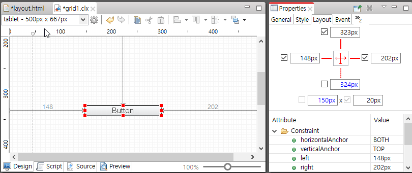
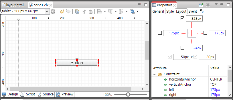
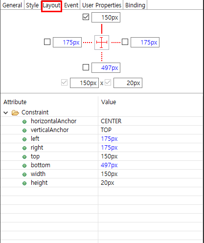
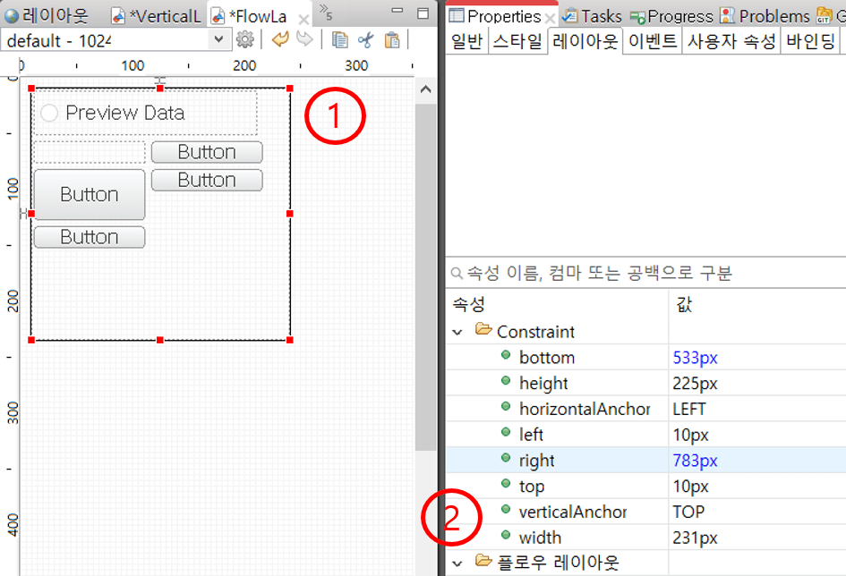
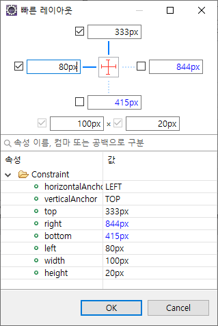
Anchor linked to left, and top - Text marked in blue in Layout is an automatically calculated value from the location and size shown in screen.
- Anchor can be changed through horizontalAnchor and verticalAnchor from Layout view property.
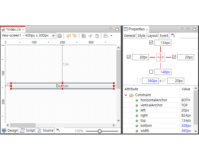
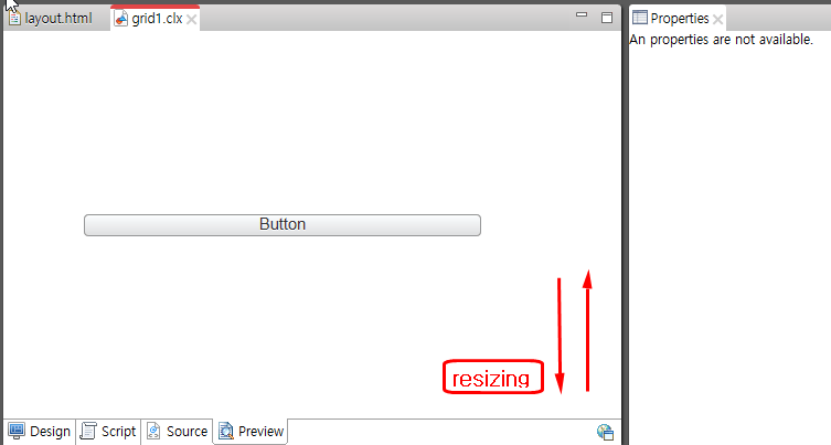
Resizing using Anchor
Increase or decrease size fit to browser size by fixing right/left or top/bottom.
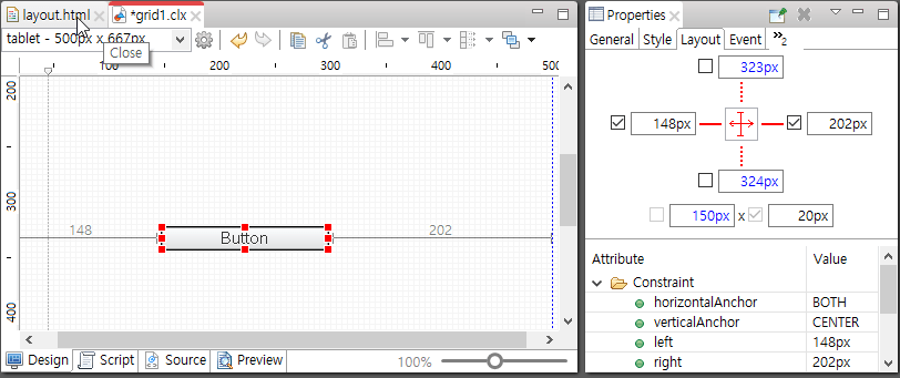
Top, bottom, and middle allocation
Disable top and bottom Anchor to locate to middle.
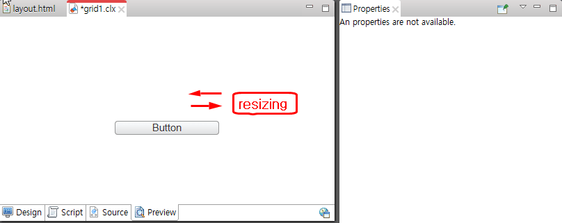
Right, left, and middle allocation
Disable left and right Anchor to locate to middle
Control Layout
The user can specify location of Control Layout from parent layout.
Layout types and features
Layouts can be assigned to App and Groups that have containers.
XY Layout
Default layout of eXBuilder6. Controls in container can be located at top, right, bottom, or left.
Responsive XY Layout
Layout allows resizing of control layout according to screen size. This layout supports various types of device.
- Layout is to be configured according to screen size.
- If there is no history to select screen in design editor, it is not correctly displayed on the web.
Form Layout
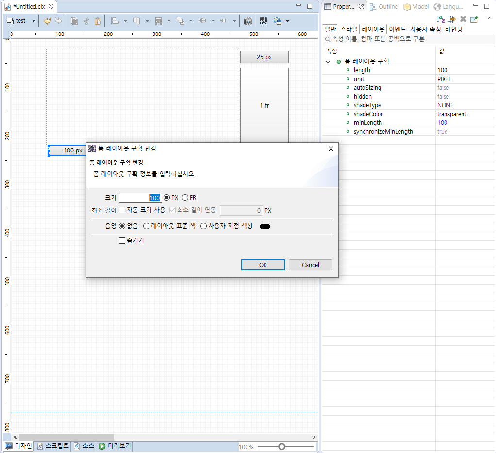
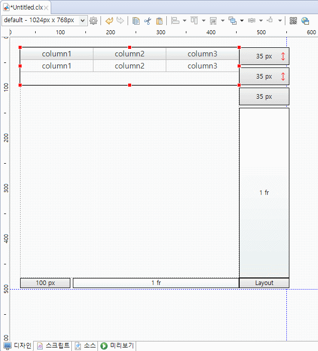
Locates controls in grid format in container. Supports only Group Control. When there are controls in form layout, click space at bottom right to view the property. If double click on PIXEL and FRACTION, a FormDivision update dialog box will pop up. Click to update property under [properties- General, Layout] Tab
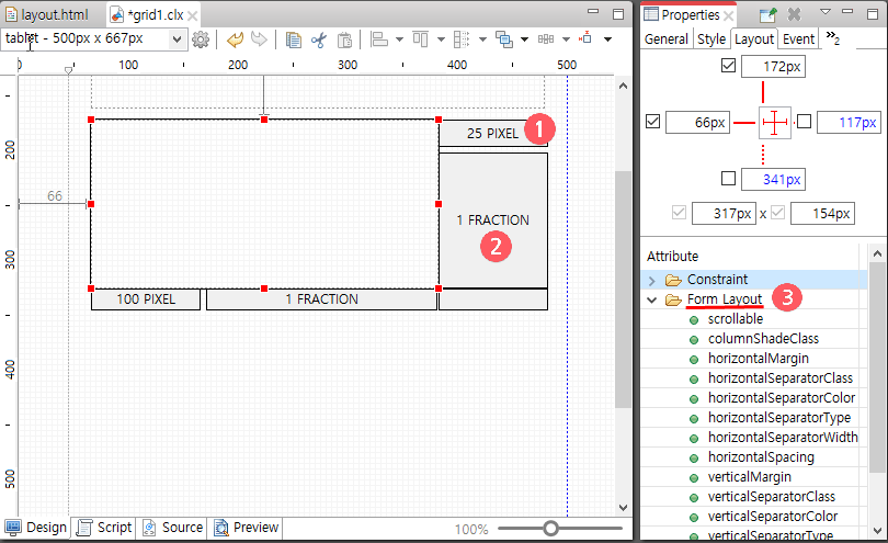
- PIXEL: Has fixed size in pixel.
- FRACTION: Relative ratio unit has relative size. If two FRACTION values in the same row and column are all 1, size is in ratio of 1: 1.
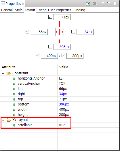
- 3. Form Layout Property
Property Description scrollable The user can scroll in case of overflow columnShadeClass Specify style class of column to apply shade horizontalMargin Specify margin at the end of right and left. horizontalSeparatorClass Specify class of horizontal break line. Set horizontalSeparatorType to apply. horizontalSeparatorColor Specify color of horizontal break line. Set horizontalSeparatorType to apply. horizontalSeparatorType Specify type of horizontal break line. - NONE: Do not exit.
- BY_CLASS: Applied according to horizontalSeparatorClass Property.
- CUSTOM: Apply value of horizontalSeparatorColor and horizontalSeparatorWidth in property
horizontalSeparatorWidth Specify width of horizontal break line horizontalSpacing Specify space of horizontal break line verticalMargin Specify margin between top and bottom. verticalSeparatorClass Specify class of vertical break line. Set verticalSeparatorType to apply verticalSeparatorColor Specify color of vertical break line. Set verticalSeparatorType to apply. verticalSeparatorType Specify type of vertical break line. - NONE: Do not exist.
- BY_CLASS: Applied according to verticalSeparatorClassProperty.
- CUSTOM: Apply value of verticalSeparatorColor and verticalSeparatorWidth in property.
verticalSeparatorWidth Specify width of vertical break line. verticalSpacing Specify space of vertical break line. userResizingMode If there are horizontal and vertical dividers, you need to define an action for the user to resize the form dividers by dragging them. - none : Resizing by dragging is not allowed.
- standard : It allows resizing by dragging and resizing in real time while dragging.
- lightweight : Change the size after dragging.
horizontalSpacing Specifies the spacing of the horizontal dividers. verticalMargin Specifies the values for the top and bottom margins. verticalSeparatorClass Specifies the class of the vertical divider. VerticalSeparatorType must be specified to apply. verticalSeparatorColor Specifies the color of the vertical divider. VerticalSeparatorType must be specified to apply. verticalSeparatorType Specifies the type of vertical separator line. - NONE: None
- BY_CLASS: Applied according to the verticalSeparatorClass property.
- CUSTOM: The values of verticalSeparatorColor and verticalSeparatorWidth of the properties are applied.
verticalSeparatorWidth Specifies the width of the vertical divider. verticalSpacing Specifies the spacing of vertical dividers. Apply divider css when userResizingMode property value is lightweight
It can be set in the form-layout.part.less file.Basic css
@import "../settings.part.less";

.cl-formlayout-vertical-lightweight-resizer,
.cl-formlayout-horizontal-lightweight-resizer {
	/* lightweight resizer style */
}
...
Custom css
@import "../settings.part.less";

.cl-formlayout-vertical-lightweight-resizer {
	background-color: green;
	mix-blend-mode: normal;
}

.cl-formlayout-horizontal-lightweight-resizer {
	background-color: orange;
	mix-blend-mode: normal;
}.
Form layout compartments
In the form layout, you can view the properties for the entire row and column by clicking the column that shows the size of the rows and columns on the right and bottom.
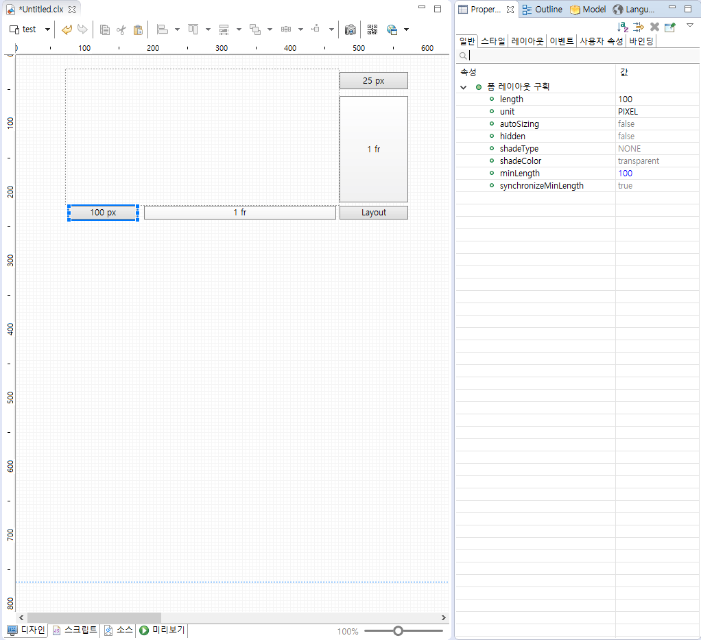
If you double-click the row or column, you can see the form partition editor pop-up window. In the form partition editor, you can specify properties for shading and size for that row, column.
You can specify auto-size usage properties in rows per FX and minimum size in rows per FR.
- If the size unit of a row column is PX
- If the size unit of a row column is FR
Property Description hidden Hiding or not length Width of row or column unit a unit of width shadeColor a shade of color shadeType Types of Shades minLength Minimum length of column in FR units (in px) synchronizeMinLength Whether to use px units and apply reference size as minimum length when auto size is applied
| Property | Description |
|---|---|
| autoSizing | Whether automatic size based on content is applied |
| hidden | Hiding or not |
| length | Width of row or column |
| shadeColor | a shade of color |
| shadeType | Types of Shades |
| unit | a unit of width |
| minLength | Minimum length of column in FR units (in px) |
| synchronizeMinLength | Whether the reference size is applied to minimum length when automatic size is applied to minimum length |
If you specify the form layout compartment as auto-size
If the cell area where the control is placed is auto-sized across all rows and columns in the form layout, auto-size is applied for that control. If even one row or column is not auto-sized Automatic size is not applied for that control.
Form Layout Feature: Push
This feature allows a single control in the form layout to be moved one cell to the right or left. The movement is based on cell units.
The feature works only when exactly one control placed in the form layout is selected.
If the movement contacts a vertically merged control (row-span), the operation stops with a warning sound. If it contacts a horizontally merged control (col-span), the merged width is reduced by one to secure movement space.
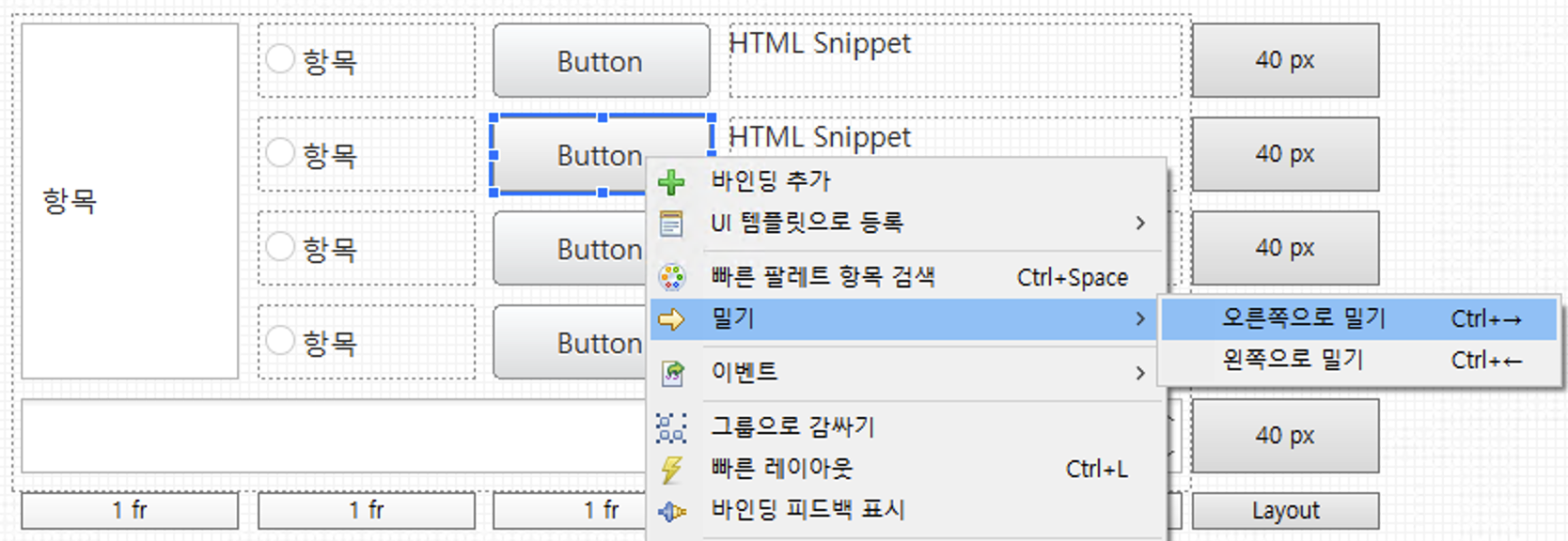
Push Operation Rules
| Rule Item | Action Description |
|---|---|
| Activation Condition | The push function can be used when only one control inside the form layout is selected. |
| Row Merge Collision | If a row-merged control exists at the push target location, it is handled as not movable with a beep sound. |
| Column Merge Collision | If a column-merged control exists at the push target location, the column merge width of that control decreases by 1 to secure movement space. |
| Pushing Right at the Right End of a Row | When pushing right at the rightmost position of the current row, the control moves to the first cell of the next row. |
| Pushing Left at the Left End of a Row | When pushing left at the leftmost position of the current row, the control moves to the last cell of the previous row. |
| Pushing Left from the First Row | If the selected control is in the top row and located at the left end, pushing left is handled as not movable because there is no previous row. |
| Pushing Right from the Last Row | If the selected control is in the last row and located at the right end, a new row is created when pushing right, and the pushed control is placed in the first cell of that row. |
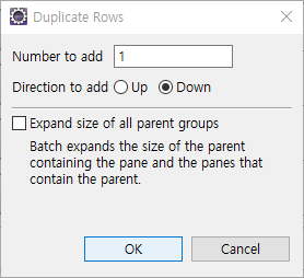
Form Layout Feature: Duplicate Row/Column
This feature allows you to duplicate based on a single row/column within the form layout. All controls and properties of the selected row/column are copied and added.
It is activated when one section of the form layout's row/column is selected.
If you duplicate a 'row' containing a vertically merged control (rowSpan is 2 or more), the control is not duplicated and the size (RowSpan) is increased. The same logic applies to 'column'.
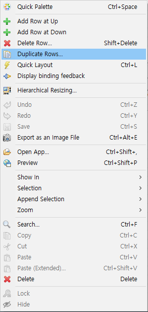
If you turn on the 'Expand size of all parent groups' option, the size of the entire form layout automatically increases by the size of the added section.
Vertical Layout
A layout in which controls can be placed vertically. It is a layout that can be useful for mobile screen development because it is arranged vertically even if various controls are dynamically arranged.
- Layout: Vertical layouts are placed vertically.
- Vertical Layout Properties
Property Description spacing Option to set the interval between each control.The default value is 5, and if you modify the value to 0, the gap between the controls disappears.
Ex) If you set the spacing to 0 and the height of the five controls to 20%, you can fill the entire layout without any free space.verticalMargin Property that sets the top and bottom spacing of the layout.
Default value is 0.horizontalMargin Property that sets the left and right spacing of the layout.
Default value is 0.Distribution How to place controls in one row. There are four attributes: fill, center, leading, and tracking, respectively Fill is fill method / Center is center alignment / leading is left alignment / trailing is right alignment. 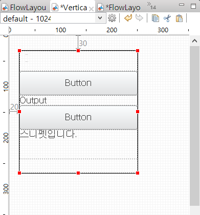
Vertical Layout fill options 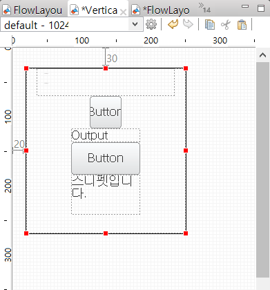
Vertical Layout center options 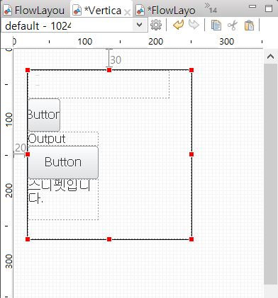
Vertical Layout leading options 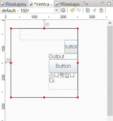
Vertical Layout trailing options - Control layout properties
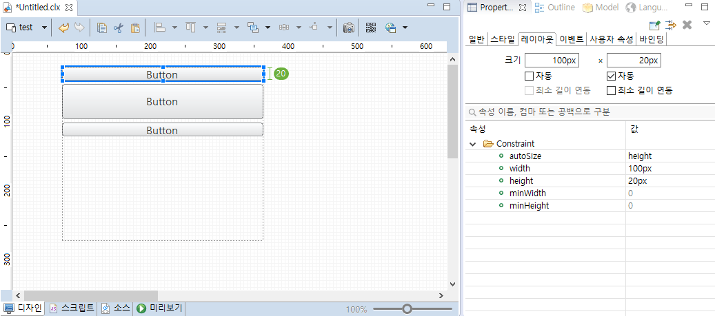
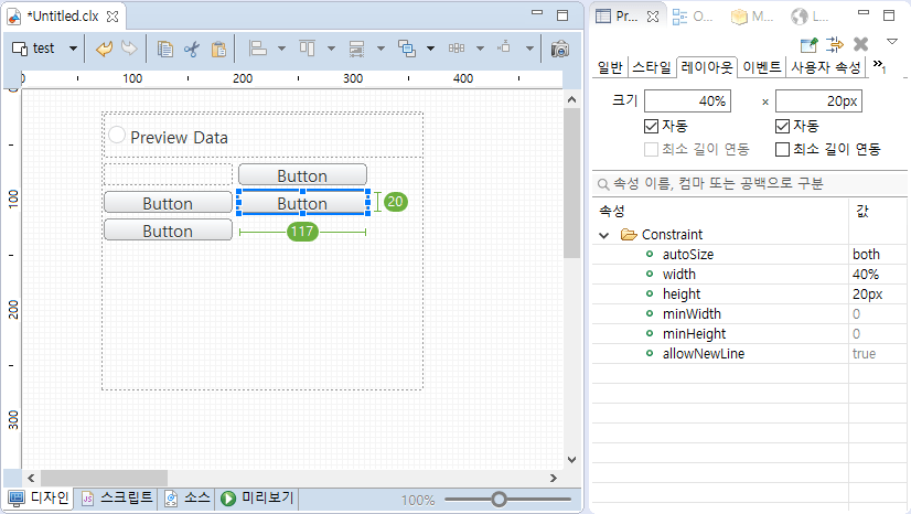
Property Description autoSize How to determine the type of auto-size to use. There are four properties: none, both, width, and height, each of which is the same size as you created on the Design tab. The option shown on the site is both length and height, and then the option shown on the site is only length / height is only height. height Option to set the height of the control. By default, it is in px units, but it also supports % units. (The flow layout does not support the height function.) width Option to set the length of the control. By default, it is in units of px, but it also supports units of %. (Vertical layout does not support width functionality.) minWidth Minimum horizontal size of the control when applying automatic width. minHegiht The minimum vertical size of the control when applying automatic height. - Auto-size example of vertical layout
Among the control properties in the vertical layout, the autoSize property is a property that can be applied whether or not the controls are auto-sized.
Create two identical buttons in the vertical layout, one of which changes the autoSize property to none / both, as shown.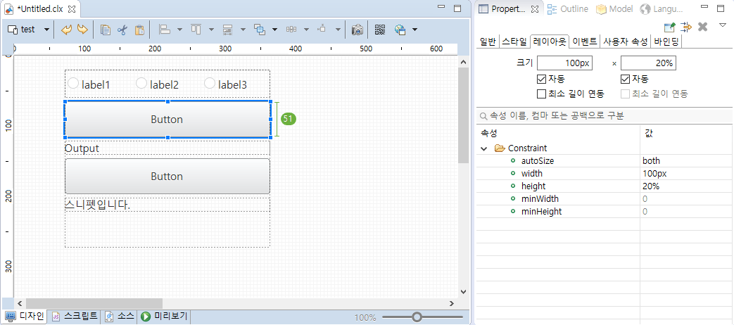
setting the autoSize option to both 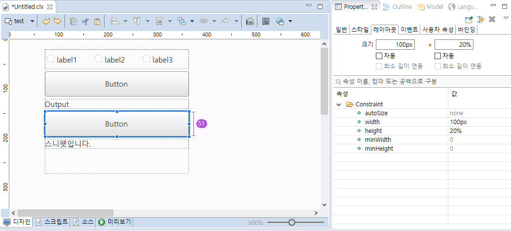
setting the autoSize option to none View the results in the preview.
Size difference of buttons according to autoSize - Example of setting the minimum length interworking when the control included in the vertical layout has an autoSize property of height
Sets the autoSize property of the control included in the vertical layout to height.
set to autoSize property height In the Properties view of the control, check the Height Minimum Length Interlock check box and enter the value you want to set to the minimum height.
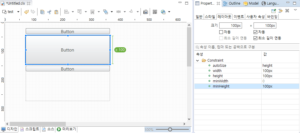
Set minimum height to 100 View the results before and after applying the minimum length in the preview.
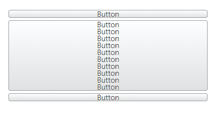
Before applying minimum length interlock 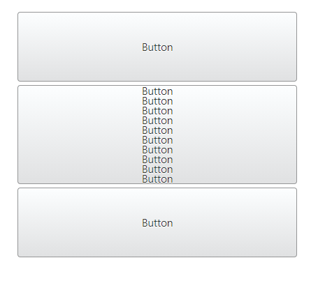
After applying the minimum length interlocking
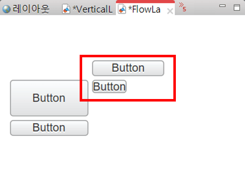
Flow layout
A layout in which controls can be placed in turn. Even if various controls are placed dynamically, they are placed in order, and line breaks are automatically made when the group is full.
- Layout: The floating layout is aligned as a turn.
- Flow layout properties
Property Description spacing Option to set the interval between each control.The default value is 5, and if you modify the value to 0, the gap between the controls disappears.
Ex) If you set the spacing to 0 and the width of the five controls to 20%, you can fill the entire layout without any free space.verticalMargin Property that sets the top and bottom spacing of the layout.
Default value is 0.horizontalMargin Property that sets the left and right spacing of the layout.
Default value is 0. - Control layout properties
Property Description autoSize How to determine the type of auto-size to use. There are four properties: none, both, width, and height, each of which is the same size as you created on the Design tab. / Both is the option shown on the site, and then the option shown on the site, / width is the option to apply only length / height is the height. height Option to set the height of the control. By default, it is in px units, but it also supports % units. (Flow layout does not support height functionality.) width Option to set the length of the control. By default, it is in units of px, but it also supports units of %. (Vertical layout does not support width functionality.) minWidth The minimum horizontal size of the control of automatic width. minHegiht Minimum vertical size of the control when applying automatic height. allowNewLine Whether to allow line breaks. - Example of auto-size application of flow layout
Among the control properties in the flow layout, the autoSize property is a property that can be applied whether or not the controls are auto-sized.Create two identical buttons in the flow layout, as shown, and then change the autoSize property to none / both.
setting the autoSize option to both 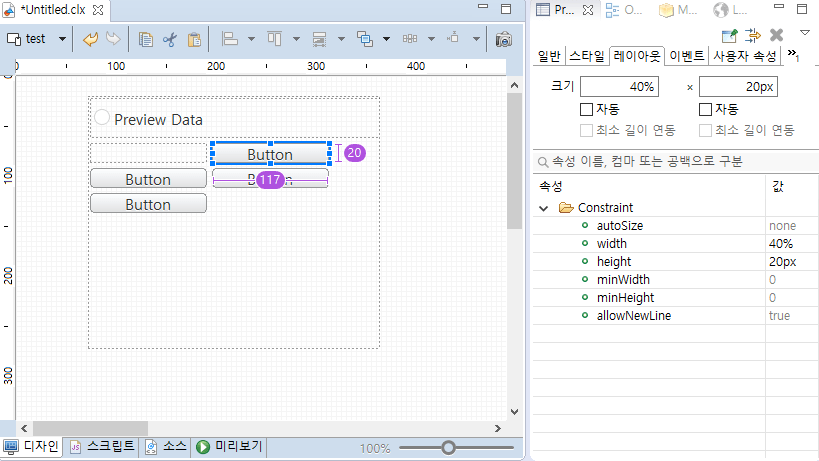
setting the autoSize option to none View the results in the preview.
Size difference of buttons according to autoSize - Example of setting the minimum width when the control included in the flow layout has the autoSize property width
Sets the autoSize property of the control included in the flow layout to width.
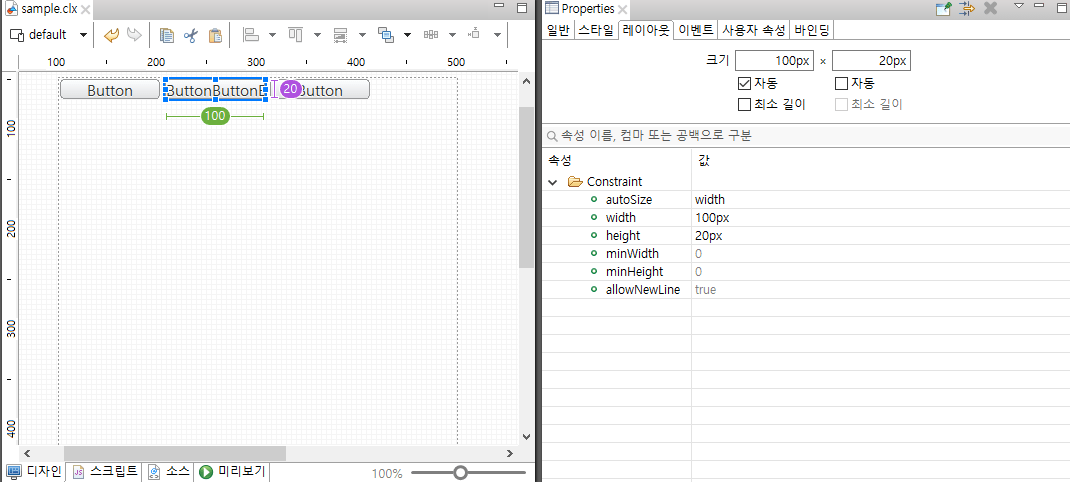
setting the autoSize property width In the Properties view of the control, check the Height Minimum Length Interlock check box and enter the value you want to set to the minimum width.
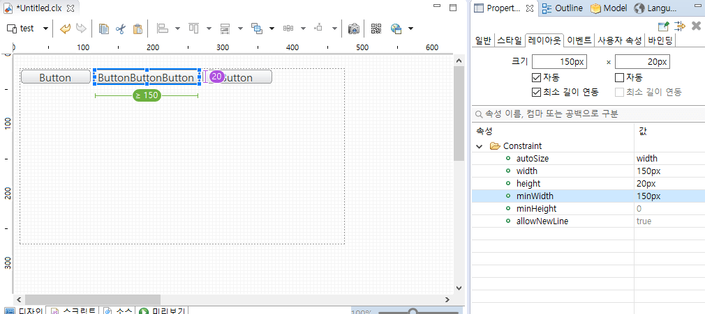
Set minimum width to 150 Check the results before and after applying the minimum length linkage in the preview.
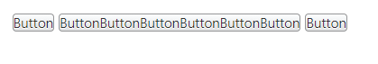
Before applying minimum length interlock 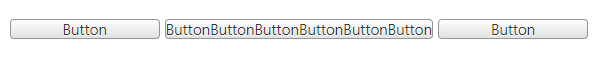
After applying the minimum length interlocking
Scroll settings
You can specify whether scrolling is possible if you leave the container area in the Container Layout view.
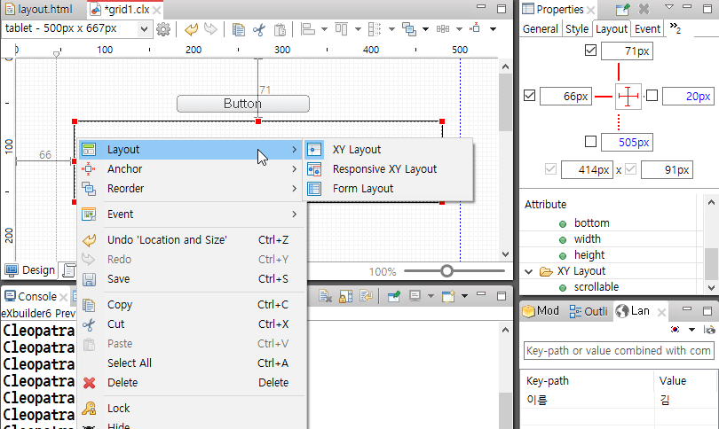
Change Layout
For layout changes, you can select App or Group in the Design Editor and set the layout in the context menu.
Control Display Settings
You can set settings for displaying controls in the layout view.
Supports specification operations and spinning when changing control size in layout view or quick layout.
Spinning key
| Input key | Description |
|---|---|
| ↓ | Subtract 1 from the value entered in the constant editor. |
| ↑ | Add 1 to the value entered in the constant editor. |
| Subtract 10 from the value entered in the constant editor. | |
| Add 10 to the value entered in the constant editor. |
measure-size event
A measure-size event is an event that occurs when calculating the size of a control.
Occurs when the autosize column of the form layout is set or the set value is changed according to the value of the autoSize property of controls located in the vertical or flow layout.
| Type | Control | height | width |
|---|---|---|---|
| UI Control | Calendar | X | X |
| UI Control | FileUpload | X | X |
| UI Control | PageIndexer | X | X |
| UI Control | Progress | X | X |
| UI Control | Slider | X | X |
| List | CheckBoxGroup | O | X |
| List | LinkedComboBox | O | O |
| List | LinkedListBox | X | O |
| List | ListBox | O | O |
| List | Menu | O | X |
| List | NavigationBar | O | O |
| List | RadioButton | O | X |
| List | Tree | O | X |
| List | ComboBox | X | X |
| List | Grid | X | X |
| Input | Button | O | O |
| Input | CheckBox | X | X |
| Input | SearchInput | X | X |
| Input | DateInput | X | X |
| Input | FileInput | X | X |
| Input | InputBox | X | X |
| Input | MaskEditor | X | X |
| Input | NumberEditor | X | X |
| Input | TextArea | X | X |
| Output | HTMLObject | X | X |
| Output | HTMLSnippet | O | O |
| Output | Image | O | O |
| Output | Notifiy | X | X |
| Output | Output | O | X |
| Output | Shell | O | O |
| Container | Accordion | X | X |
| Container | Group | O | O |
| Container | EmbbedApp | X | X |
| Container | EmbbedPage | X | X |
| Container | MDIFolder | X | X |
| Container | TabFolder | X | X |
In the control list above, the size of the controls that do not provide the height and width options can be adjusted through an event called measure-size.
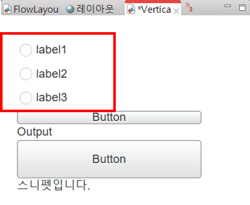
- Create a radio button and use the preceding data to make three items.
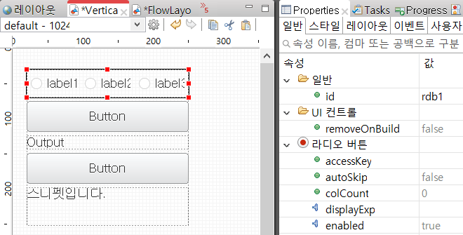
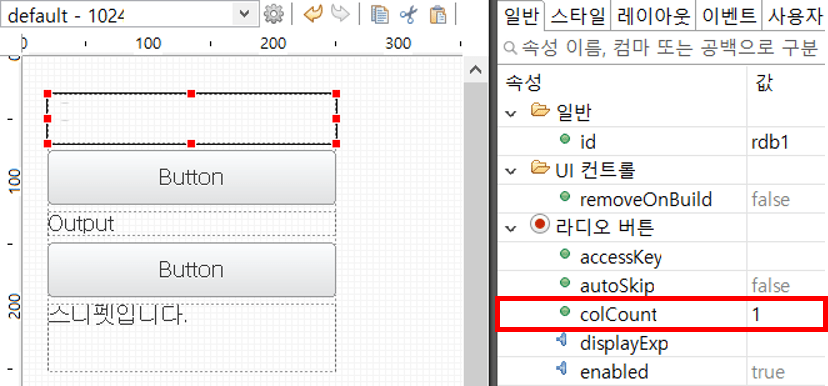
- Change the colCount on the radio button to 1. (The colCount property is an option to set the number of items to be displayed on one line of the control.))
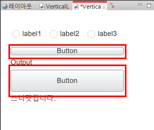
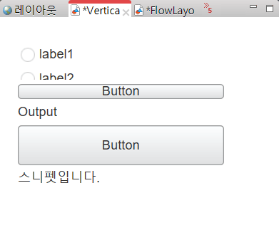
- When I check with the preview, the height is not enough, so I can't see all the items.
- Use the options to create script that multiplication-s size of each item to write 30px.
/* * Called when a measure-size event occurs in the radio button. * Events that occur when calculating the size of a control */ function onRdb1MeasureSize(/* cpr.events.CMeasureSizeEvent */ e){ /** * @type cpr.controls.RadioButton */ var rdb1 = e.control; e.height = rdb1.getItemCount() * 30; } - After you apply the script, preview it again.
Script
Method to change Control Layout according to parent layout
XY Layout
Specify Layout in parent of the control.
- Create and specify Layout in container
var xYLayout_2 = new cpr.controls.layouts.XYLayout(); var group = app.lookup("grp1"); group.setLayout(xYLayout_2); - Add Layout in control
var button = new cpr.controls.Button(); group.addChild(button,{ "top": "10px", "left": "10px", "width": "100px", "height": "20px" }); - Change Control Layout
group.updateConstraint(button,{
  "top": "20px",
  "left": "20px",
  "width": "100px",
  "height": "20px"
});
Interactive Layout
Must specify media query when specifying Interactive Layout.
- Create and specify Layout in container
var responsiveXYLayout_1 = new cpr.controls.layouts.ResponsiveXYLayout() var group = app.lookup("grp1"); group.setLayout(responsiveXYLayout_1); - Add Layout in control
var button = new cpr.controls.Button(); group.addChild(button,{ positions: [ { // Must be identical to media query specified in screen. Refer to the clx file which has been built. "media": "all and (min-width: 400px) and (max-width: 500px)", "top": "10px", "left": "10px", "width": "100px", "height": "20px" }] }); - Change Control Layout
//Modify Layout.
group.updateConstraint(button,{
positions: [
  {
    // Must be identical to media query specified in screen. Refer to the clx file which has been built.
    "media": "all and (min-width: 400px) and (max-width: 500px)",
    "top": "20px",
    "left": "20px",
    "width": "100px",
    "height": "20px"
  }]
});
Form Layout
Specify use of number of row and column in Form Layout.
- Create and specify Layout in container
var formLayout_1 = new cpr.controls.layouts.FormLayout() formLayout_1.verticalSeparatorWidth = 1; formLayout_1.verticalSeparatorColor = "#fb3131"; formLayout_1.setColumns(["100px", "1fr"]); formLayout_1.setRows(["25px", "1fr"]); var group = app.lookup("grp1"); // Specify Layout. group.setLayout(formLayout_1); - Add Layout in control
var button = new cpr.controls.Button(); // Add child control and specify layout. group.addChild(button,{ "colIndex":0, "rowIndex":0 }); - Change Control Layout
// Modify Layout.
group.updateConstraint(button,{
"colIndex":1,
"rowIndex":1
});
Vertical Layout
When you specify a vertical layout, you can adjust the autoSize properties that automatically resize.
- Creating and specifying layouts in containers
var verticalLayout_1 = new cpr.controls.layouts.VerticalLayout(); var group = app.lookup("grp1"); group.setLayout(verticalLayout_1); - Adding controls to a group with a layout set
// Add control child and specify layout var button = new cpr.controls.Button(); group.addChild(button, { "width": "50px", "height": "200px", "autoSize": "height" }); - Change the layout of the control
// Modify Layout
group.updateConstraint(button, {
	"width" : "100px",
	"height": "200px",
	"autoSize" : "none"

});
Flow Layout
When you specify a flow layout, you can adjust the autoSize properties that automatically resize.
- Creating and specifying layouts in containers
var flowLayout_1 = new cpr.controls.layouts.FlowLayout(); var group = app.lookup("grp1"); group.setLayout(flowLayout_1); - Adding controls to a group with a layout set
// Add control child and specify layout var button = new cpr.controls.Button(); group.addChild(button, { "width": "100px", "height": "50px", "autoSize": "height" }); - Change the layout of the control
// Modify Layout
group.updateConstraint(button, {
	"width": "100px",
	"height": "200px",
	"autoSize": "none"

});